 |
VOOZH | about |
|
VOOZH | about |
Text Button Class in Flutter is a material component button widgets with no border by default. It is just a regular button with some text written as the label. TextButton class is a replacement for the deprecated FlatButton class. It is undeprecated and performs all the functions of a FlatButton. To use a TextButton, you need to import the material package library i.e."package:flutter/material.dart". It can be used for navigation, in toolbars, dialog boxes, etc.
TextButton({
 Key? key,
 required VoidCallback? onPressed,
 VoidCallback? onLongPress,
 ValueChanged<bool>? onHover,
 ValueChanged<bool>? onFocusChange,
 ButtonStyle? style,
 FocusNode? focusNode,
 bool autofocus = false,
 Clip clipBehavior = Clip.none,
 required Widget child
})
A TextButton in Flutter comes with two major parameters:
1. child: This is the button's label
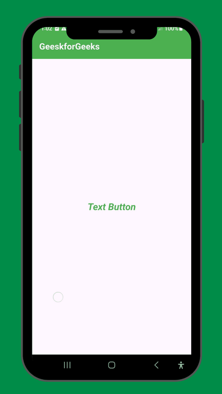
 TextButton(

 child: const Text('Text Button'),

 ),
2. onPressed: This shows the action to be performed on pressing the button
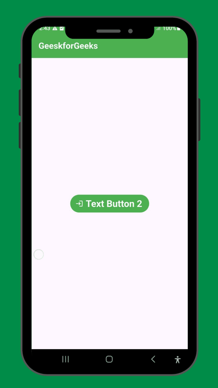
 TextButton(
 onPressed: () => Navigator.of(context)
 .push(MaterialPageRoute(builder: (context) => const NewScreen())),
 child: const Text('Flat Button'),
 ),
Property | Description |
|---|---|
autofocus | Gives a boolean value corresponding to the initial focus of the button |
clipBehaviour | Decides whether the content is clipped or not |
focusNode | Represents the focus node of the widget |
ButtonStyle | Decides the styling of the button |
onLongPress | The action to be executed when the button is long-pressed by the user |
enabled | Gives a boolean value for the activity of the button |
hashcode | Decides the hashcode of the button |
Key | Controls how one widget replaces another widget in the tree |
onFocusChanged | A method to be executed on changing the focus of the button |
onHover | Acting to be executed when the user hovers over the button |
runType | Represents the runtime of an object |
enabled | Tells whether the button is active or inactive |
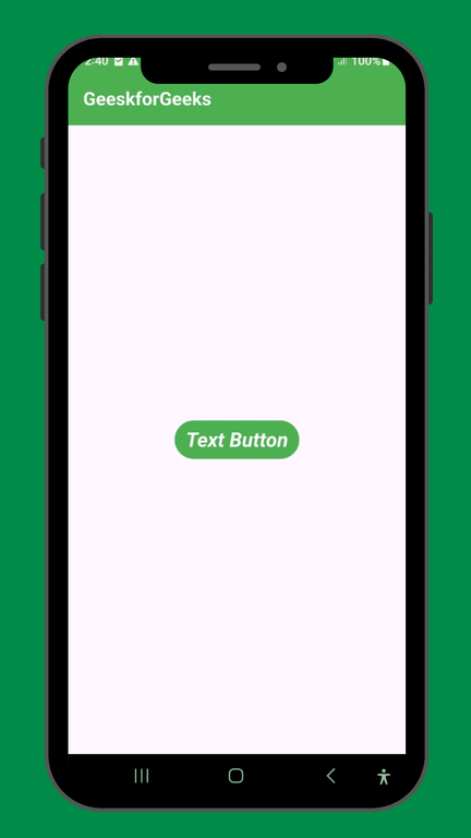
1. : It is the color of all items that are in TextButton.
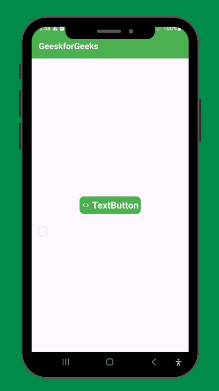
Output:
2. : It is the background color of TextButton.
Output:
Output:
Output:
Output:
Output:
Output:
Let's understand the above properties with an example
main.dart:
Output: