 |
VOOZH | about |
|
VOOZH | about |
The role of a data scientist has gained immense importance in tech companies, including Atlassian. If you're preparing for an interview at Atlassian, it’s essential to understand not only the technical skills required but also the overall interview process.
This article provides a comprehensive overview of what to expect, how to prepare, and tips for succeeding at each stage of the interview, along with potential questions you might encounter.
Table of Content
Linear regression is based on several assumptions: first, it assumes a linear relationship between the independent and dependent variables. Second, the residuals (the differences between observed and predicted values) should be independent and normally distributed. Third, there should be homoscedasticity, meaning that the variance of the residuals is constant across all levels of the independent variable. Finally, there should be no multicollinearity among the independent variables, which means they should not be highly correlated with each other.
Further Read: Linear Regression in Machine learning
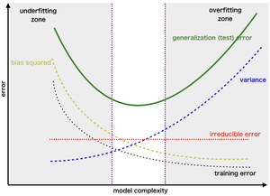
The bias-variance tradeoff is a key concept in machine learning that describes the balance between two types of errors that affect model performance. Bias refers to errors due to overly simplistic assumptions in the learning algorithm, leading to underfitting. Variance, on the other hand, refers to errors due to excessive complexity, causing the model to learn noise in the training data, which leads to overfitting. The goal is to minimize both bias and variance to improve the model’s ability to generalize to new data.
Further Read: Bias-Variance Trade Off
I would start by analyzing the dataset to understand the relationships between features and the target variable. Techniques like correlation analysis help identify strongly correlated features. I might apply Recursive Feature Elimination (RFE) to remove the least important features based on model performance. Additionally, I would consider regularization methods such as Lasso or Ridge regression, which help both select relevant features and prevent overfitting.
Further Read: Feature Selection Techniques in Machine Learning
To address class imbalance, I would first assess the extent of the imbalance in the dataset. Techniques such as oversampling the minority class or undersampling the majority class can help achieve a more balanced dataset. Another effective approach is SMOTE, which generates synthetic samples of the minority class. Additionally, I could adjust class weights in algorithms like Random Forest or support vector machines to give more importance to the minority class during training.
Further Read: Handling Imbalanced Data for Classification
Supervised learning involves training a model on a labeled dataset, where the input features are paired with the corresponding output labels. This approach is used for tasks like regression and classification. Unsupervised learning, in contrast, deals with datasets that do not have labeled outputs. Here, the model identifies patterns or structures within the data, commonly using techniques like clustering or dimensionality reduction.
Further Read: Supervised and Unsupervised learning
Cross-validation is a technique used to evaluate how the results of a statistical analysis will generalize to an independent dataset. It involves dividing the dataset into several subsets, training the model on some subsets while validating it on others. This process helps to mitigate overfitting by providing a more reliable estimate of the model's performance across different data portions and assists in hyperparameter tuning.
Further Read: Cross Validation in Machine Learning
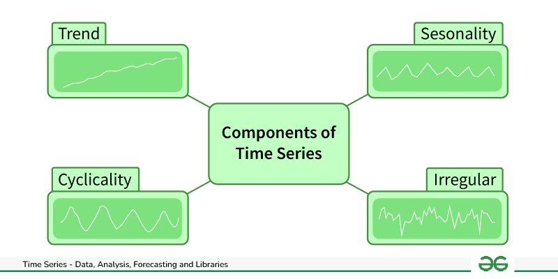
I would begin by visualizing the time series data to identify trends, seasonal patterns, and anomalies. Based on this analysis, I would select an appropriate model, such as ARIMA for linear trends or LSTM for more complex patterns. Preprocessing is critical, particularly ensuring the data is stationary. After training the model, I would evaluate its performance using metrics like Mean Absolute Error (MAE) or Root Mean Squared Error (RMSE).
Further Read : Time Series Analysis and Forecasting
I worked on a computer vision project focused on classifying images of various objects. I collected a labeled dataset and performed data preprocessing, including normalization and data augmentation. I designed a convolutional neural network (CNN) architecture suitable for image data. After training the model, I evaluated its performance using metrics like accuracy and the confusion matrix, which helped in refining the model based on its classification results.
Decision trees are interpretable and easy to visualize, making them user-friendly. They can handle both numerical and categorical data, and they require little data preprocessing. However, they are prone to overfitting, especially with deep trees, and can be sensitive to noise in the data. Additionally, small changes in the data can result in very different trees.
Further Read: Decision Tree
Bagging, or Bootstrap Aggregating, involves training multiple models independently and then combining their predictions to reduce variance. It works well with high-variance models like decision trees. Boosting, on the other hand, builds models sequentially, where each model attempts to correct the errors of its predecessor. This method generally improves the model's accuracy but can be prone to overfitting if not carefully controlled.
Further Read: Bagging vs Boosting in Machine Learning
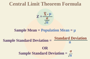
The Central Limit Theorem states that the distribution of sample means will approach a normal distribution as the sample size increases, regardless of the population's distribution, provided the sample size is sufficiently large (usually around 30 or more).
This theorem is important because it allows statisticians to make inferences about population parameters using normal distribution-based methods, even when the underlying data is not normally distributed.
Further Read - Central Limit Theorem Formula
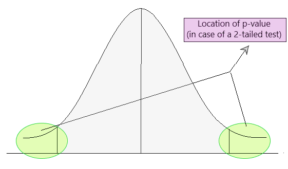
I would explain that a p-value helps us understand whether the evidence we have contradicts a null hypothesis. A low p-value (typically less than 0.05) indicates that the observed results are unlikely to have occurred if the null hypothesis were true, leading us to consider rejecting the null hypothesis. However, a p-value does not measure the strength of the effect or confirm that a hypothesis is true; it simply assesses evidence.
Further Read: P-Value
In a previous project, I conducted A/B testing to evaluate two different user interface designs for our application. I randomly assigned users to one of the two designs and measured key metrics such as engagement and conversion rates. The results indicated a significant improvement in user engagement with one design, leading to its implementation. This data-driven approach helped justify the design change to stakeholders.
Further Read: What is A/B Testing?
Correlation indicates a relationship between two variables, but it does not imply that one causes the other. Understanding this distinction is crucial because decisions based on correlation can lead to misleading conclusions. Causation implies that changes in one variable directly result in changes in another. Identifying causal relationships often requires controlled experimentation or additional statistical analysis.
Further Read: Correlation Vs Causation
A confusion matrix is a performance measurement tool for classification models. It displays true positive, true negative, false positive, and false negative values. By analyzing these values, I can calculate various metrics such as accuracy, precision, recall, and F1-score. This helps to understand the model's strengths and weaknesses, including its ability to correctly classify different classes.
Futher Read: Understanding the Confusion Matrix in Machine Learning
In Python, I commonly use Pandas for data manipulation due to its powerful data structures and functions. NumPy is essential for numerical operations and handling arrays. For data visualization, I often turn to Matplotlib and Seaborn. In R, I rely on the tidyverse collection, particularly dplyr for data manipulation and ggplot2 for creating visualizations, as they provide a cohesive set of tools for data analysis.
Further Read - R vs Python
To optimize a slow-running SQL query, I would analyze the execution plan to identify bottlenecks. Adding appropriate indexes to frequently queried columns can significantly improve performance. I would also avoid using SELECT * and instead specify only the necessary columns. Additionally, I would review the join conditions and consider simplifying the query or aggregating data beforehand to reduce processing time.
Further Read -Best Practices For SQL Query Optimizations
Certainly! The SQL query would look like this:
SELECT customer_id, SUM(revenue) AS total_revenue
FROM sales
GROUP BY customer_id
ORDER BY total_revenue DESC
LIMIT 10;
This query calculates total revenue for each customer and retrieves the top 10 customers based on that revenue.
To join multiple datasets, I would first ensure that there is a common key or identifier across the datasets. Depending on the desired result, I would choose an inner join to include only matching records, a left join to retain all records from one dataset, or a full outer join to combine all records. Careful handling of duplicates and null values is essential, and I would use SQL JOIN clauses or the Pandas merge() function as needed.
Further Read: Join multiple Datasets
Data cleaning techniques include handling missing values through imputation or removal, checking for duplicates, and verifying data types. I also standardize formats for consistency, perform outlier detection using statistical methods or visualization, and ensure that categorical variables are encoded correctly. These steps are vital to prepare the data for analysis and modeling.
Further Read: Best Data Cleaning Techniques for Preparing Your Data
Key principles include clarity, simplicity, and accuracy. Visualizations should avoid unnecessary clutter and focus on conveying the message clearly. Appropriate scales, colors, and labels enhance understanding. Choosing the right type of chart for the data is crucial, as is providing context through titles and annotations to guide the audience's interpretation.
Further Read - 6 Tips for Creating Effective Data Visualizations
In a previous role, I created a dashboard visualizing user engagement metrics for different product features. The visualization revealed a significant drop in engagement for one feature, prompting the product team to investigate further. This analysis led to a redesign based on user feedback, resulting in a 30% increase in engagement after the relaunch.
I prefer using Tableau for its user-friendly interface and ability to create interactive dashboards quickly. In Python, I frequently use Matplotlib and Seaborn for their flexibility in creating a variety of plots. Plotly is great for building interactive visualizations that can be shared online. My choice depends on the project's specific requirements and the audience's needs.
I ensure accessibility by focusing on clarity and avoiding complex visuals. I use contrasting colors that are colorblind-friendly and provide descriptive titles, labels, and annotations for context. Avoiding jargon is essential, and I solicit feedback from diverse team members to identify any areas needing simplification or further explanation.
Common pitfalls include overcomplicating visuals with too many elements, which can confuse the audience. Using misleading scales or inappropriate chart types can distort the message. Failing to provide context, such as missing labels or legends, hinders understanding. Additionally, not considering the audience's familiarity with the data can result in visuals that are too technical or simplistic.
Further Read - Bad Data Visualization Examples Explained
Choosing the right algorithm depends on the problem type, the data's nature, and the specific requirements for interpretability and accuracy. I start by analyzing the data and its relationships, experimenting with different algorithms, and evaluating their performance. For linearly separable data, I might use logistic regression, while for more complex patterns, I might opt for tree-based methods or neural networks. I also consider computational resources and time available for training.
Further Read: How to Choose Right Machine Learning Algorithm?
Common metrics for evaluating regression models include Mean Absolute Error (MAE), Mean Squared Error (MSE), and R-squared. MAE provides a straightforward average of absolute errors, while MSE emphasizes larger errors due to squaring the differences. R-squared indicates the proportion of variance explained by the model, helping to understand its effectiveness.
Further Read : Regression in machine learning
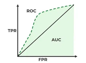
I would explain that an ROC curve is a graphical representation of a model's ability to distinguish between two classes. It plots the true positive rate against the false positive rate at various thresholds. The area under the ROC curve (AUC) provides a single measure of the model's performance; a value of 1 indicates perfect classification, while a value of 0.5 suggests no discriminative ability.
Further Read: AUC ROC Curve in Machine Learning
Overfitting occurs when a model learns not only the underlying patterns but also the noise in the training data, leading to poor generalization on unseen data. To prevent overfitting, I can use techniques such as cross-validation, regularization methods (like Lasso or Ridge), and limiting the complexity of the model (such as pruning decision trees). Ensuring a sufficient amount of training data also helps in mitigating this issue.
Further Read : How to Avoid Overfitting in Machine Learning?
Model interpretability is crucial as it allows stakeholders to understand how decisions are made, fostering trust in the model's predictions. It is especially important in regulated industries or situations where understanding the rationale behind decisions is essential. Interpretable models can help identify biases or flaws in the data and facilitate better decision-making.
Further Read: Model Interpretability
To identify key metrics for a new feature, I would start by defining the feature's objectives and how it aligns with user needs and business goals. Engaging with stakeholders to gather insights is vital. I would then consider metrics like user adoption rates, engagement levels, and customer feedback to evaluate the feature’s impact. Setting up tracking mechanisms to monitor these metrics post-launch ensures continuous assessment.
I would use a combination of quantitative and qualitative methods. Analyzing user interaction data through tools like Google Analytics can reveal patterns in usage, while conducting user interviews or surveys can provide deeper insights into motivations and pain points. Segmenting users based on behavior can help tailor features and improve the user experience.
In a previous role, our analysis of user feedback revealed that many users struggled with a specific feature, leading to high churn rates. Presenting this data to the product team prompted a redesign of the feature based on user needs. The changes resulted in improved user satisfaction and a significant reduction in churn, showcasing the power of data-driven decision-making.
I prioritize projects based on factors such as business impact, alignment with strategic goals, and resource availability. I also consider the potential for quick wins versus long-term benefits. Engaging with stakeholders to understand their priorities and conducting a feasibility analysis helps ensure that the most valuable projects receive attention.
I would start by analyzing user engagement metrics to identify trends and patterns in the decline. Segmenting users based on demographics or usage patterns can provide insights into specific groups affected. I would also review feedback from user surveys or customer support to uncover potential pain points. Combining quantitative analysis with qualitative insights can lead to a comprehensive understanding of the issue.
In a previous project, there was a disagreement about the approach to a data analysis task. I facilitated a meeting where each team member could express their views. By encouraging open communication and focusing on the project goals, we collaboratively identified a compromise that integrated elements from both perspectives. This not only resolved the conflict but also strengthened team cohesion.
I worked on a project that involved developing a new analytics dashboard for our product. This required close collaboration between the data science, product, and design teams. Regular meetings ensured alignment on objectives, and we established clear communication channels. The collaborative effort resulted in a well-received dashboard that met user needs and drove engagement.
I prioritize tasks based on urgency and importance, breaking larger projects into manageable steps. I maintain open communication with stakeholders to set realistic expectations and provide updates. When facing tight deadlines, I focus on delivering high-quality work while being adaptable to any changes that arise.
I am motivated by the ability to turn data into actionable insights that drive decision-making. The challenge of solving complex problems and continuously learning about new techniques and tools keeps me engaged. Additionally, I find satisfaction in collaborating with cross-functional teams to create solutions that positively impact users.
In a previous project, I underestimated the complexity of a data cleaning task, leading to delays in the overall timeline. I learned the importance of thorough project scoping and risk assessment. Since then, I have incorporated more detailed planning and allocated buffer time for unforeseen challenges, improving my project management skills.
Preparing for a Data Scientist interview at Atlassian requires a well-rounded approach that balances technical expertise, problem-solving skills, and business acumen. By mastering core data science concepts, staying proficient in tools like Python and SQL, and practicing real-life case studies, you'll be well-equipped for technical questions.