 |
VOOZH | about |
|
VOOZH | about |
Seaborn is a wonderful visualization library provided by python. It has several kinds of plots through which it provides the amazing visualization capabilities. Some of them include count plot, scatter plot, pair plots, regression plots, matrix plots and much more. This article deals with the matrix plots in seaborn.
Example 1: Heatmaps
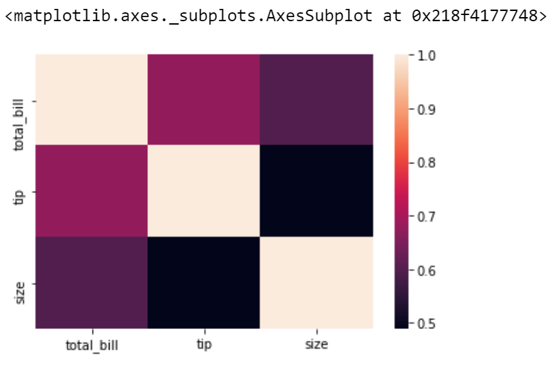
Heatmap is a way to show some sort of matrix plot. To use a heatmap the data should be in a matrix form. By matrix we mean that the index name and the column name must match in some way so that the data that we fill inside the cells are relevant. Lets look at an example to understand this better.
Code : Python program
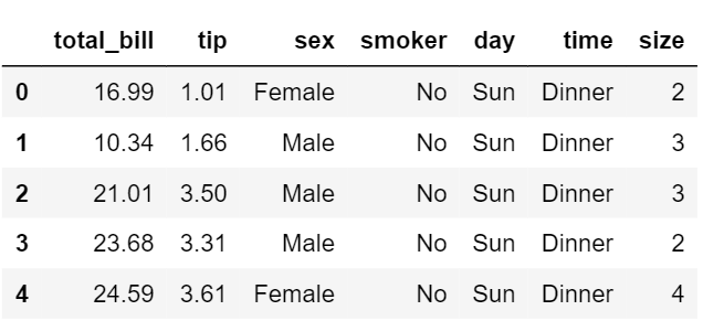
The first five entries of the dataset
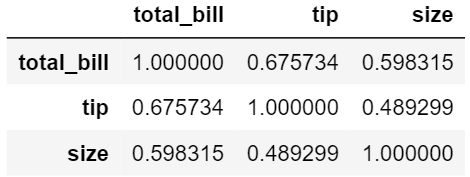
The correlation matrix
Heatmap of the correlated matrix
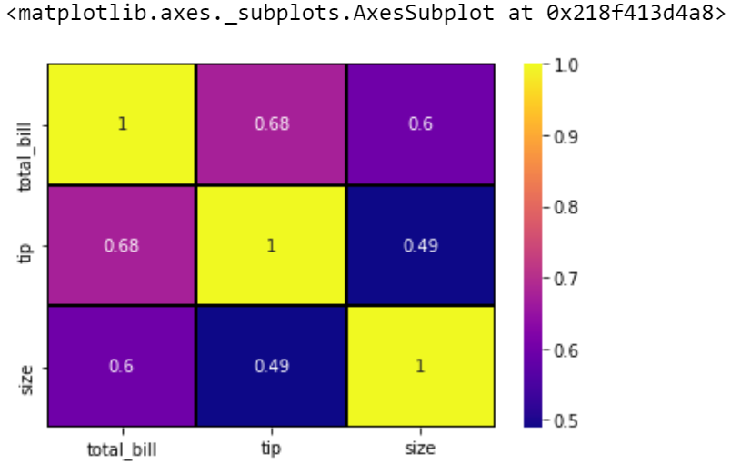
Inorder to obtain a better visualization with the heatmap, we can add the parameters such as annot, linewidth and line colour.
Explanation
Here is a plot that shows those attributes.
So we can say that all a heatmap does is color the cells based on the gradient and uses some parameters to increase the data visualization.
Example 2: Cluster maps
Cluster maps use hierarchical clustering. It performs the clustering based on the similarity of the rows and columns.
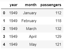
The first five entries of the dataset
The matrix created using the pivot table(first five entries)
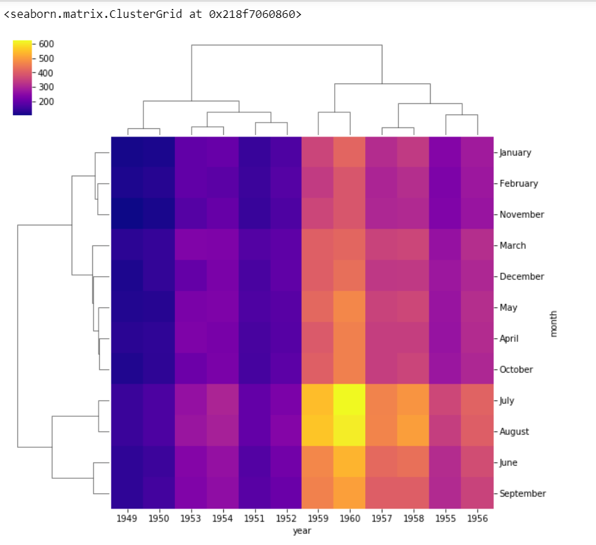
Clustermap from the given data
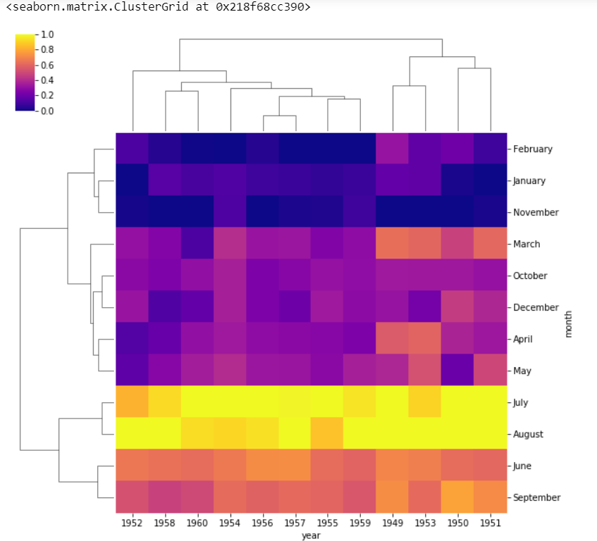
We can also change the scale of the color bar by using the standard_scale parameter.
Clustermap after using standard scaling
standard_scale = 1 normalizes the data from 0 to 1 range. We can see that the months as well as years are no longer in order as they are clustered according to the similarity in case of clustermaps.
So we can conclude that a heatmap will display things in the order we give whereas the cluster map clusters the data based on similarity.