 |
VOOZH | about |
|
VOOZH | about |
Predictive analytics in healthcare can significantly enhance patient outcomes and streamline healthcare operations. Visualization plays a critical role in understanding the data and the predictions made by analytical models. In this article, we will explore predictive healthcare analysis using R Programming Language, focusing on creating insightful visualizations with a synthetic dataset.
Predictive healthcare analysis involves using historical data and statistical methods to predict future outcomes, such as patient readmission rates, disease progression, and resource utilization. Visualizations help in understanding patterns and deriving actionable insights from these predictions.
We'll create a synthetic dataset to explain healthcare data.
Output:
# A tibble: 6 × 9
 PatientID Age Gender BMI BloodPressure Cholesterol Diabetes HeartDisease Readmission
 <int> <int> <chr> <dbl> <dbl> <dbl> <chr> <chr> <chr>
1 1 48 Female 15.4 104 238 Yes No Yes
2 2 68 Female 37.6 142 183 Yes Yes Yes
3 3 31 Female 34.9 154 238 Yes No Yes
4 4 84 Male 16.9 115 290 Yes Yes Yes
5 5 59 Female 17.5 92 110 Yes No No
6 6 67 Male 19.3 154 224 No No No
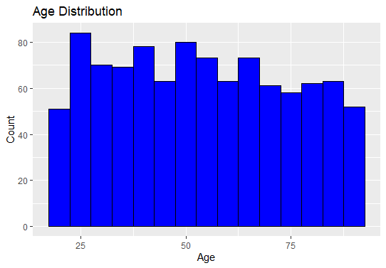
Understanding the age distribution of patients can help identify the age group most affected by certain conditions.
Output:
This histogram shows the frequency distribution of patients' ages, helping us to identify the most common age ranges in the dataset.
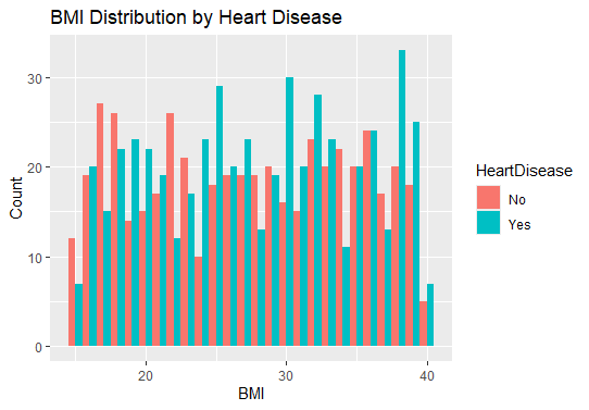
Analyzing the distribution of BMI with respect to heart disease status.
Output:
This histogram can reveal if there's a relationship between BMI and heart disease, indicating whether higher or lower BMIs are associated with heart disease.
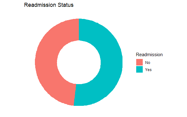
Donut charts are a variation of pie charts with a hole in the center, often used to display a part-to-whole relationship.
Output:
The resulting chart is a donut chart that visualizes the distribution of readmission statuses in the healthcare dataset. Here's a breakdown of what you will see in the output:
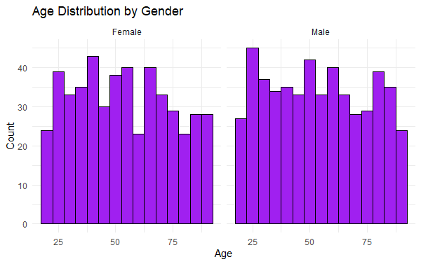
Faceting allows for the creation of multiple subplots based on a categorical variable.
Output:
This faceted histogram to visualize the age distribution of patients, separated by gender. The geom_histogram() function creates histograms with a bin width of 5 years, and each gender (Male and Female) has its own subplot due to facet_wrap(~ Gender). The fill color of the bars is set to purple with black outlines. The labs() function adds a title and axis labels to the plot. theme_minimal() applies a clean, minimalistic theme to the chart. This visualization allows for an easy comparison of age distributions between males and females in the dataset.
We will build a logistic regression model to predict the likelihood of readmission.
Output:
Confusion Matrix and Statistics

 Reference
Prediction No Yes
 No 40 79
 Yes 104 76

 Accuracy : 0.388
 95% CI : (0.3324, 0.4458)
 No Information Rate : 0.5184
 P-Value [Acc > NIR] : 1.00000

 Kappa : -0.2333

 Mcnemar's Test P-Value : 0.07604

 Sensitivity : 0.2778
 Specificity : 0.4903
 Pos Pred Value : 0.3361
 Neg Pred Value : 0.4222
 Prevalence : 0.4816
 Detection Rate : 0.1338
 Detection Prevalence : 0.3980
 Balanced Accuracy : 0.3841

 'Positive' Class : No
Predictive healthcare analysis in R provides valuable insights that can help healthcare providers improve patient outcomes and operational efficiency. By creating a synthetic dataset, performing exploratory data analysis, building predictive models, and visualizing the results, we can uncover patterns and make informed decisions. Advanced visualizations, such as pie charts, donut charts, stacked bar charts, and faceted histograms, play a crucial role in interpreting the data and the model's performance.