In this article, we will learn how to create A Time Series Plot With Seaborn And Pandas. Let's discuss some concepts :
- Pandas is an open-source library that's built on top of NumPy library. It's a Python package that gives various data structures and operations for manipulating numerical data and statistics. It's mainly popular for importing and analyzing data much easier. Pandas is fast and it's high-performance & productive for users.
- Seaborn is a tremendous visualization library for statistical graphics plotting in Python. It provides beautiful default styles and color palettes to form statistical plots more attractive. It's built on the highest of matplotlib library and also closely integrated to the info structures from pandas.
- A timeplot (sometimes called a statistic graph) displays values against the clock. They're almost like x-y graphs, but while an x-y graph can plot a spread of “x” variables (for example, height, weight, age), timeplots can only display time on the x-axis. Unlike the pie charts and bar charts, these plots don't have categories. Timeplots are good for showing how data changes over time. For instance, this sort of chart would work well if you were sampling data randomly times.
Steps Needed
- Import packages
- Import / Load / Create data.
- Plot the time series plot over data using lineplot (as tsplot was replaced with lineplot since Sep 2020).
Examples
Here, we create a rough data for understanding the time series plot with the help of some examples. Let's create the data :
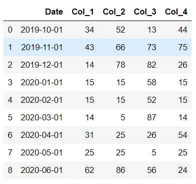
Output:
👁 Image
Example 1: Simple time series plot with single column using lineplot
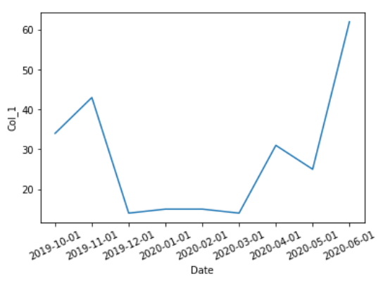
Output :
👁 Image
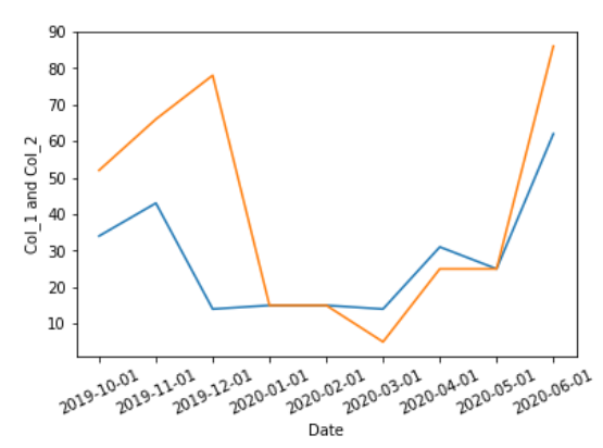
Example 2: (Simple time series plot with multiple columns using line plot)
Output :
👁 Image
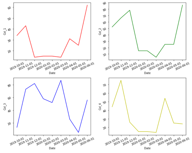
Example 3: Multiple time series plot with multiple columns
