 |
VOOZH | about |
|
VOOZH | about |
Plotly is a Python library which is used to design graphs, especially interactive graphs. It can plot various graphs and charts like histogram, barplot, boxplot, spreadplot and many more. It is mainly used in data analysis as well as financial analysis. plotly is an interactive visualization library.
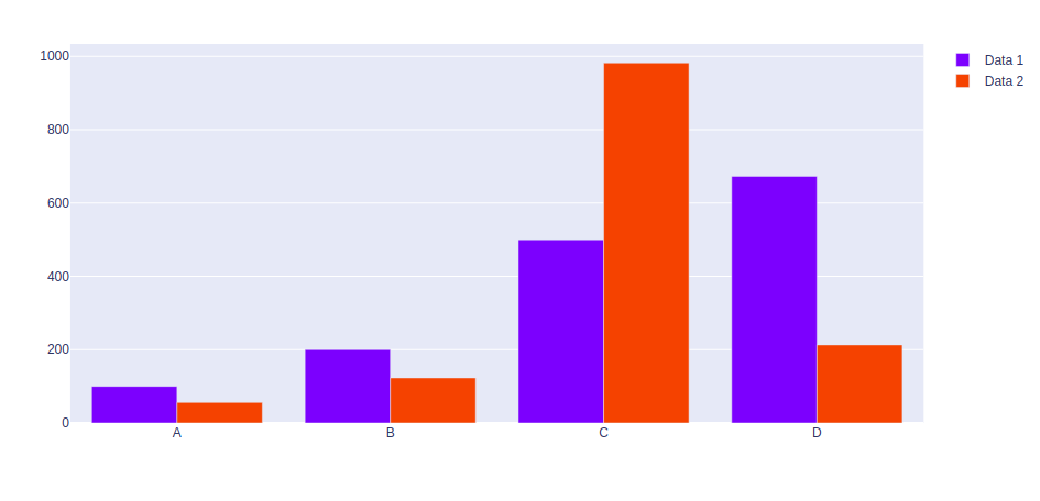
Grouping bar charts can be used to show multiple set of data items which are been compared with a single color which is used to indicate a specific series across all sets.
Method 1: Using graph_objects class
Example:
Output:
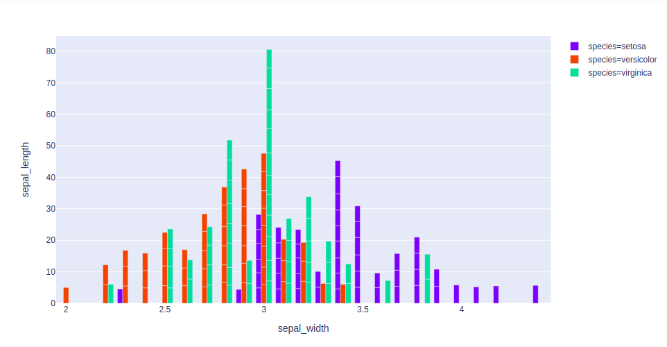
Method 2: Using express class
Example 1: Iris dataset
Output:
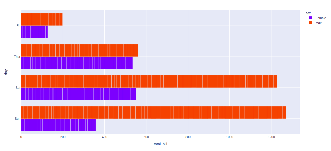
Example 2: Tips dataset
Output: