 |
VOOZH | about |
|
VOOZH | about |
matplotlib.pyplot.hist() function is used to create histograms, which are graphical representations of data distribution. It divides the data into bins (non-overlapping intervals) and counts the frequency of values in each bin, plotting them as bars.
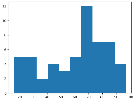
Lets consider the data values and visualise histogram with help of an example:
Output
matplotlib.pyplot.hist(x, bins=None, range=None, density=False, histtype='bar', color=None, label=None)
Parameters:
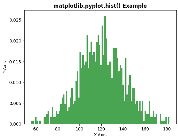
Example 1: In this example, we will create a histogram and pass the necessary parameters such as bins, color, density, etc.
Output
Note: In this example, density=True is used in plt.hist(). When this parameter is enabled, histogram is normalized and y-axis represents probability density instead of frequency counts. Because of this, values on the vertical axis may appear as decimal numbers instead of whole numbers.
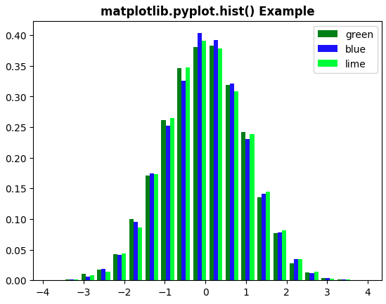
Example 2: In this example, we will create a histogram with different attributes using matplotlib.pyplot.hist() function. We define a specific set of colors for the bars of the histogram bars.
Output