 |
VOOZH | about |
|
VOOZH | about |
GeoPandas is a powerful open-source Python library that extends the functionality of Pandas to support spatial/geographic operations. It brings the simplicity of pandas to geospatial data and makes it easy to visualize and analyze geographical datasets with minimal code. GeoPandas combines several libraries:
You can install the required libraries using pip:
pip install geopandas
pip install matplotlib
pip install numpy
pip install pandas
Alternatively, platforms like Google Colab or Jupyter Notebook often have many of these pre-installed or allow for quick installation within cells.
Step 1: Import Required Modules
Step 2: Load Sample GeoSpatial Dataset
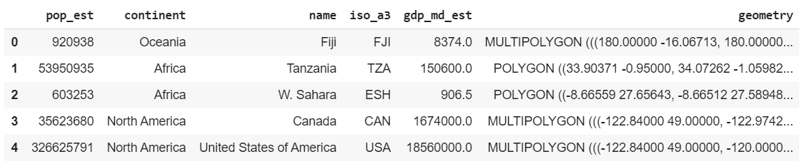
GeoPandas provides sample datasets for practice. One of the most commonly used is the world map dataset, which includes country-level geographic and economic information.
Output
Explanation: This loads the built-in world dataset containing country-level geometries and attributes like population, GDP and continent. head() displays the first few records.
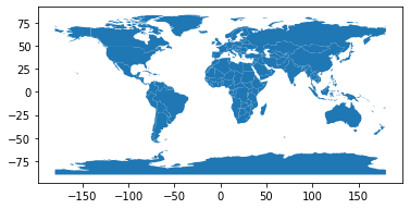
GeoPandas makes geospatial plotting simple. Using the built-in world dataset and the .plot() method, we can quickly visualize country boundaries:
Output
Explanation: A simple .plot() call visualizes country boundaries. Adding a title with Matplotlib improves clarity.
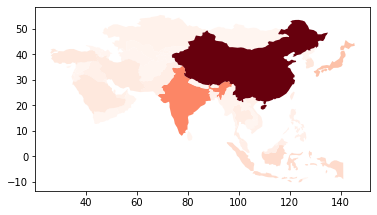
To focus on a specific region, we can filter the dataset. Here, we extract only Asian countries and visualize their GDP estimates (gdp_md_est) using a red color gradient:
Explanation: This filters the dataset to only include Asian countries, then plots them using a red color gradient based on GDP (gdp_md_est). The legend=True adds a scale.
To visualize population estimates (pop_est), we can use the cmap property to apply color gradients—lighter shades indicate lower values, darker shades indicate higher ones:
Output:
Explanation: This uses the pop_est column to apply a color gradient—automatically mapping population estimates to shades of blue (default).
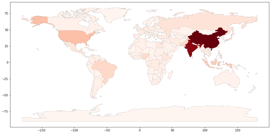
The default population plot lacks visual clarity. We improve it by:
Output:
Explanation: First, a larger figure is created. A base black world map provides contrast. Then, population data is overlaid using a red color map (cmap='Reds') to improve visual clarity.
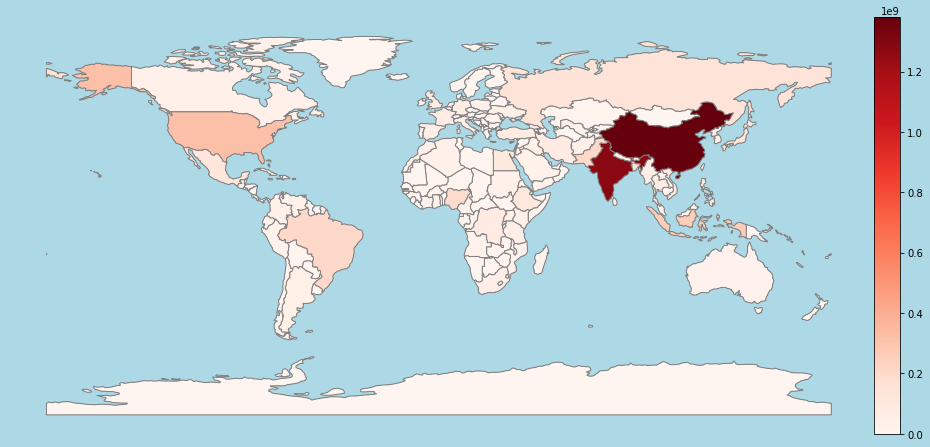
To improve map readability, we add a color bar to show the data scale. Using the facecolor parameter (e.g., light blue) enhances visual contrast. We then apply make_axes_locatable from mpl_toolkits.axes_grid1 to create a side space for the color bar.
Output:
Explanation: This enhances the map with a clear color bar indicating population ranges. make_axes_locatable creates space for it, while a light blue background improves aesthetics. Red shades represent population estimates, with a legend showing intensity levels.