 |
VOOZH | about |
|
VOOZH | about |
Plotly is a Python library which is used to design graphs, especially interactive graphs. It can plot various graphs and charts like histogram, barplot, boxplot, spreadplot and many more. It is mainly used in data analysis as well as financial analysis. plotly is an interactive visualization library.
Scatter plot are those charts in which data points are represented horizontally and on vertical axis to show that how one variable affect on another variable. The scatter() method of graph_objects class produces a scatter trace. The mode of the property decides the appearance of data points.
Syntax: plotly.graph_objects.Scatter(arg=None, cliponaxis=None, connectgaps=None, customdata=None, customdatasrc=None, dx=None, dy=None, error_x=None, error_y=None, fill=None, fillcolor=None, groupnorm=None, hoverinfo=None, hoverinfosrc=None, hoverlabel=None, hoveron=None, hovertemplate=None, hovertemplatesrc=None, hovertext=None, hovertextsrc=None, ids=None, idssrc=None, legendgroup=None, line=None, marker=None, meta=None, metasrc=None, mode=None, name=None, opacity=None, orientation=None, r=None, rsrc=None, selected=None, selectedpoints=None, showlegend=None, stackgaps=None, stackgroup=None, stream=None, t=None, text=None, textfont=None, textposition=None, textpositionsrc=None, textsrc=None, texttemplate=None, texttemplatesrc=None, tsrc=None, uid=None, uirevision=None, unselected=None, visible=None, x=None, x0=None, xaxis=None, xcalendar=None, xsrc=None, y=None, y0=None, yaxis=None, ycalendar=None, ysrc=None, **kwargs)
Parameters:
| Name | Description |
|---|---|
| dx | Sets the x coordinate step. |
| dy | Sets the y coordinate step. |
| x | Sets the x coordinates. |
| x0 | Alternate to x. Builds a linear space of x coordinates. Use with dx where x0 is the starting coordinate and dx the step. |
| y | Sets the y coordinates. |
| y0 | Alternate to y. Builds a linear space of y coordinates. Use with dy where y0 is the starting coordinate and dy the step. |
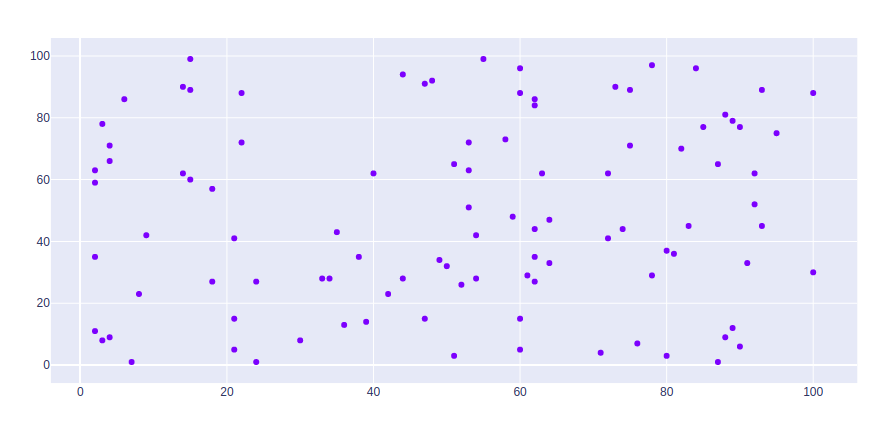
Example:
Output:
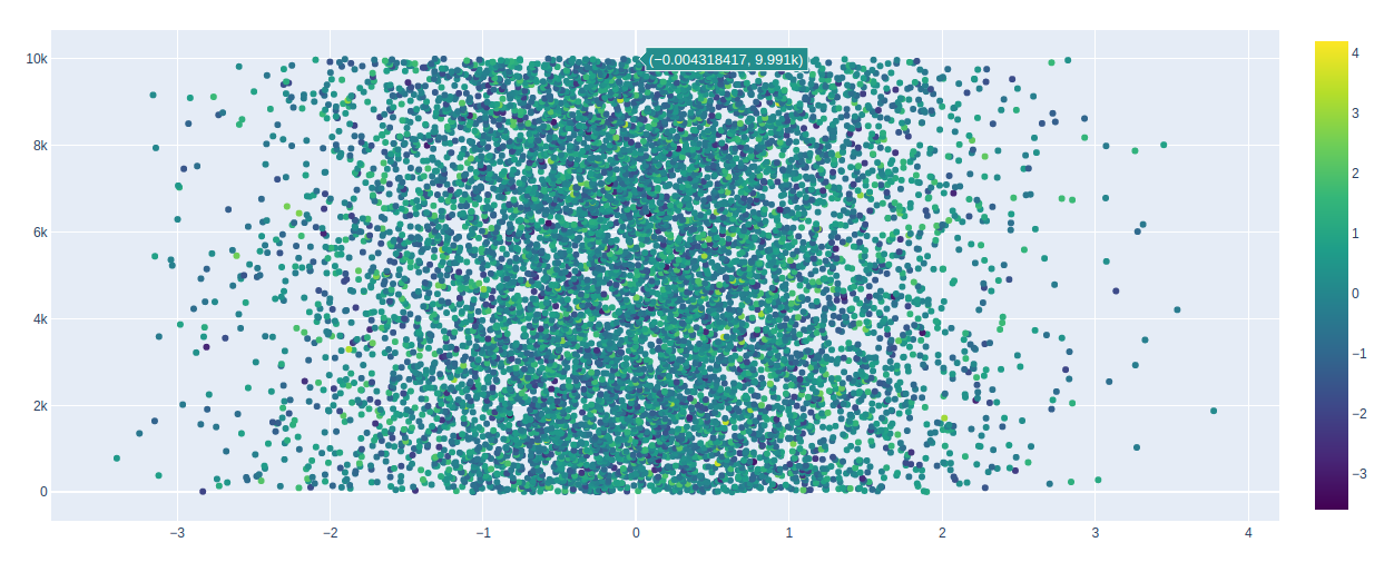
Color scale can be shown using the showscale parameter. This parameter takes a boolean value. If the value is true then the scale is shown otherwise not.
Example:
Output:
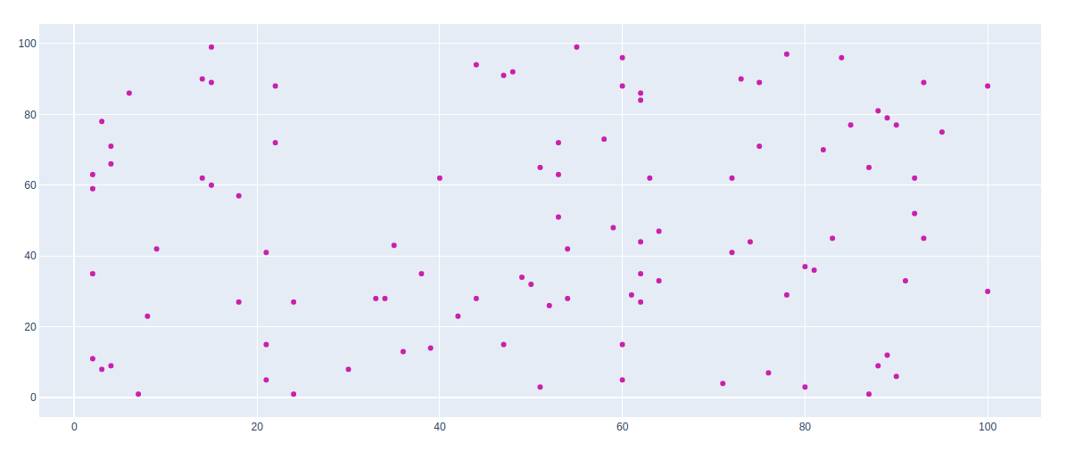
In scatter plot can be styled using keywords arguments, let's see the examples given below:
Example 1: Changing the color of the graph
Output:
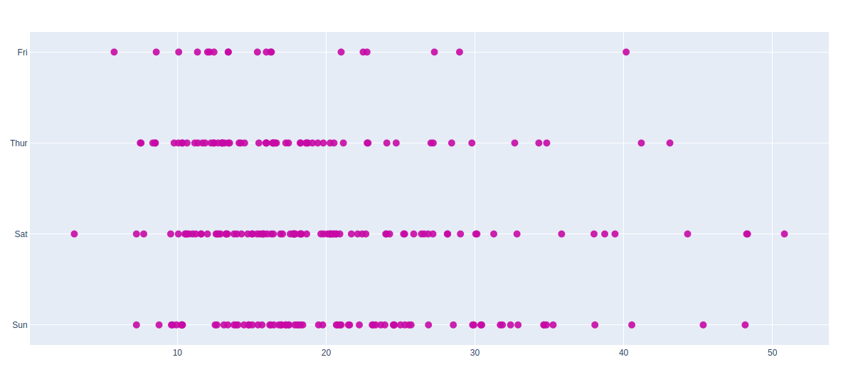
Example 2: Using tips dataset
Output:
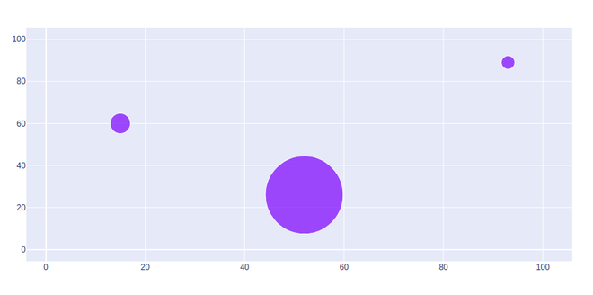
The bubble scatter plot can be created using the marker size. Marker size and color are used to control the overall size of the marker. Marker size helps to maintain the color inside the bubble in the graph.
Example: