 |
VOOZH | about |
|
VOOZH | about |
Prerequisites: Seaborn
Scatter Plot with Marginal Histograms is basically a joint distribution plot with the marginal distributions of the two variables. In data visualization, we often plot the joint behavior of two random variables (bi-variate distribution) or any number of random variables. But if data is too large, overlapping can be an issue. Hence, to distinguish between variables it is useful to have the probability distribution of each variable on the side along with the joint plot. This individual probability distribution of a random variable is referred to as its marginal probability distribution.
In seaborn, this is facilitated with jointplot(). It represents the bi-variate distribution using scatterplot() and the marginal distributions using histplot().
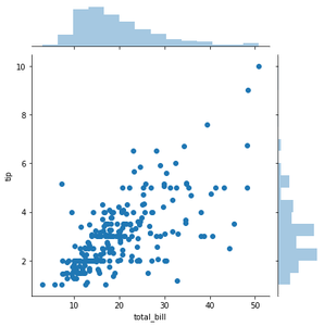
Example 1:
Output :
<seaborn.axisgrid.JointGrid at 0x26203152688>
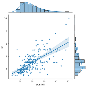
Example 2: Using kind=”reg” attribute you can add a linear regression fit and univariate KDE curves.
Output :
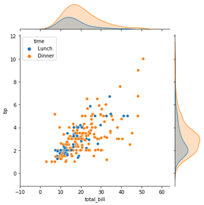
Example3: To add conditional colors to the scatterplot you can use hue attribute but it draws separate density curves (using kdeplot()) on the marginal axes.
Output :