 |
VOOZH | about |
|
VOOZH | about |
A heatmap is a graphical representation of data where individual values are represented by color intensity. It is widely used in data analysis and visualization to identify patterns, correlations and trends within a dataset. Heatmaps in Seaborn can be plotted using the seaborn.heatmap() function, which offers extensive customization options. Let's explore different methods to create and enhance heatmaps using Seaborn.
Example: The following example demonstrates how to create a simple heatmap using the Seaborn library.
Explanation: This will produce a heatmap where the intensity of color represents the magnitude of values in the matrix.
seaborn.heatmap(data, *, vmin=None, vmax=None, cmap=None, center=None, annot_kws=None, linewidths=0, linecolor='white', cbar=True, **kwargs)
Parameters:
Note: All parameters except data are optional.
Returns: returns an object of type matplotlib.axes.Axes
Example 1: By setting vmin and vmax, we explicitly define the range of values that influence the color scaling in the heatmap. This ensures consistency across multiple heatmaps, preventing extreme values from distorting the visualization.
Output:
Explanation: The parameters vmin=30 and vmax=70 define the limits of the color scale range. Values lower than 30 are represented by the lowest intensity color, while values higher than 70 are mapped to the highest intensity color.
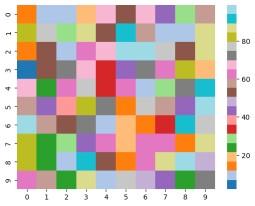
Example 2: The cmap parameter allows us to modify the color scheme of the heatmap, improving its visual appeal and making it easier to distinguish between different values.
Output:
Explanation: The argument cmap='tab20' sets a categorical colormap. Sequential colormaps (Blues, Reds, Greens) suit continuous data, while diverging colormaps (coolwarm, RdBu) highlight variations.
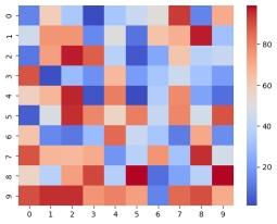
Example 3: By setting the center parameter, we ensure that a specific value (such as the mean or median) appears neutral in the colormap. This adjustment makes deviations above and below this value more distinguishable.
Output:
Explanation: The center=50 parameter sets 50 as a neutral color. Values above it are shaded in one color (e.g., red) and below in another (e.g., blue), making it useful for highlighting deviations from a reference point.
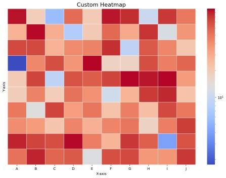
Seaborn's heatmap() function provides various options for customization, allowing users to enhance visualization by adjusting color schemes, labels, scaling and spacing.
Output:
Explanation: