 |
VOOZH | about |
|
VOOZH | about |
Seaborn is an amazing visualization library for statistical graphics plotting in Python. It provides beautiful default styles and color palettes to make statistical plots more attractive. It is built on top of the matplotlib library and also closely integrated into the data structures from pandas.
A strip plot is drawn on its own. It is a good complement to a boxplot or violinplot in cases where all observations are shown along with some representation of the underlying distribution. It is used to draw a scatter plot based on the category.
Syntax: seaborn.stripplot(*, x=None, y=None, hue=None, data=None, order=None, hue_order=None, jitter=True, dodge=False, orient=None, color=None, palette=None, size=5, edgecolor='gray', linewidth=0, ax=None, **kwargs)
Parameters:
- x, y, hue: Inputs for plotting long-form data.
- data: Dataset for plotting.
- order: It is the order to plot the categorical levels in.
- color: It is the color for all of the elements, or seed for a gradient palette
Returns: This method returns the Axes object with the plot drawn onto it.
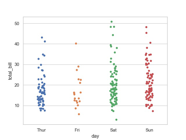
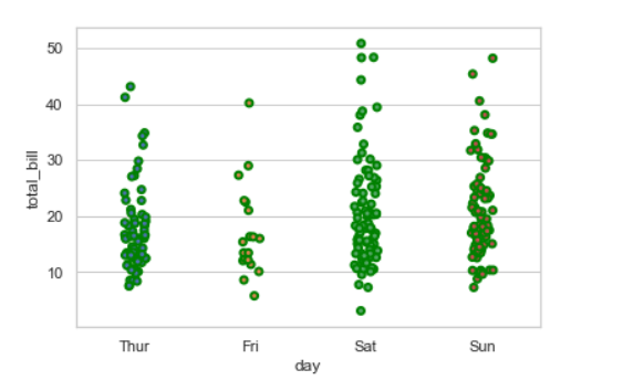
Example: Basic visualization of “tips” dataset using stripplot()
Output:
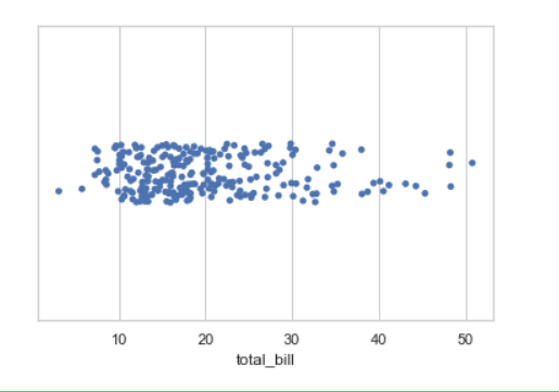
👁 ImageIf we use only one data variable instead of two data variables then it means that the axis denotes each of these data variables as an axis.
X denotes an x-axis and y denote a y-axis.
Syntax:
seaborn.stripplot(x)
Code:
Output:
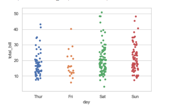
👁 Imagejitter can be used to provide displacements along the horizontal axis, which is useful when there are large clusters of data points. You can specify the amount of jitter (half the width of the uniform random variable support), or just use True for a good default.
Syntax:
seaborn.stripplot(x, y, data, jitter)
Code:
Output:
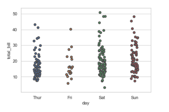
👁 ImageWidth of the gray lines that frame the plot elements. Whenever we increase linewidth than the point also will increase automatically.
Syntax:
seaborn.stripplot(x, y, data, linewidth)
Output:
👁 ImageWe can change the color with edgecolor
Output:
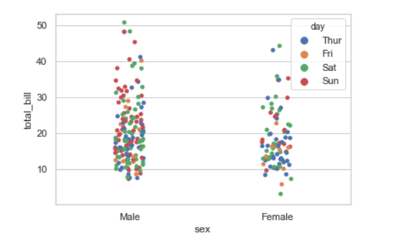
👁 ImageWhile the points are plotted in two dimensions, another dimension can be added to the plot by coloring the points according to a third variable.
Syntax:
sns.stripplot(x, y, hue, data);
Output:
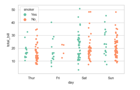
👁 ImageWhen using hue nesting, setting dodge should be True will separate the strips for different hue levels along the categorical axis. And Palette is used for the different levels of the hue variable.
Syntax:
seaborn.stripplot(x, y, data, hue, palette, dodge)
Output:
👁 ImagePossible values of palette are :
Accent, Accent_r, Blues, Blues_r, BrBG, BrBG_r, BuGn, BuGn_r, BuPu, BuPu_r,
CMRmap, CMRmap_r, Dark2, Dark2_r, GnBu, GnBu_r, Greens, Greens_r, Greys, Greys_r,
OrRd, OrRd_r, Oranges, Oranges_r, PRGn, PRGn_r, Paired, Paired_r, Pastel1, Pastel1_r, Pastel2,
Pastel2_r, PiYG, PiYG_r, PuBu, PuBuGn, PuBuGn_r, PuBu_r, PuOr, PuOr_r, PuRd, PuRd_r, Purples,
Purples_r, RdBu, RdBu_r, RdGy, RdGy_r, RdPu, RdPu_r, RdYlBu, RdYlBu_r, RdYlGn, RdYlGn_r, Reds,
Reds_r, Set1, Set1_r, Set2, Set2_r, Set3, Set3_r, Spectral, Spectral_r, Wistia, Wistia_r, YlGn,
YlGnBu, YlGnBu_r, YlGn_r, YlOrBr, YlOrBr_r, YlOrRd, YlOrRd_r, afmhot, afmhot_r, autumn, autumn_r,
binary, binary_r, bone, bone_r, brg, brg_r, bwr, bwr_r, cividis, cividis_r, cool, cool_r, coolwarm,
coolwarm_r, copper, copper_r, cubehelix, cubehelix_r, flag, flag_r, gist_earth, gist_earth_r,
gist_gray, gist_gray_r, gist_heat, gist_heat_r, gist_ncar, gist_ncar_r, gist_rainbow, gist_rainbow_r,
gist_stern, gist_stern_r, gist_yarg, gist_yarg_r, gnuplot, gnuplot2, gnuplot2_r, gnuplot_r,
gray, gray_r, hot, hot_r, hsv, hsv_r, icefire, icefire_r, inferno, inferno_r, jet, jet_r, magma,
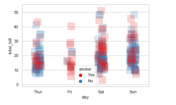
We will use alpha to manage transparency of the data point, and use marker for marker to customize the data point.