 |
VOOZH | about |
|
VOOZH | about |
Seaborn is an amazing visualization library for statistical graphics plotting in Python. It provides beautiful default styles and color palettes to make statistical plots more attractive. It is built on the top of the matplotlib library and also closely integrated into the data structures from pandas.
Seaborn swarmplot is probably similar to stripplot, only the points are adjusted so it won't get overlap to each other as it helps to represent the better representation of the distribution of values. A swarm plot can be drawn on its own, but it is also a good complement to a box, preferable because the associated names will be used to annotate the axes. This type of plot sometimes known as “beeswarm”.
Syntax: seaborn.swarmplot(x=None, y=None, hue=None, data=None, order=None, hue_order=None, dodge=False, orient=None, color=None, palette=None, size=5, edgecolor='gray', linewidth=0, ax=None, **kwargs)
Parameters:
x, y, hue: Inputs for plotting long-form data.
data: Dataset for plotting.
color: Color for all of the elements
size: Radius of the markers, in points.
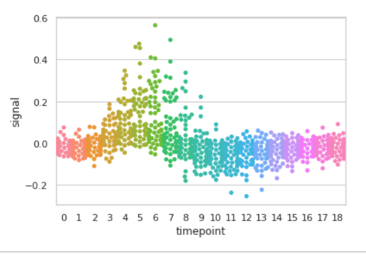
Example 1: Basic visualization of “fmri” dataset using swarmplot()
Output:
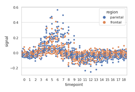
Example 2: Grouping data points on the basis of category, here as region and event.
Output:
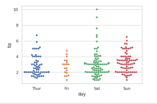
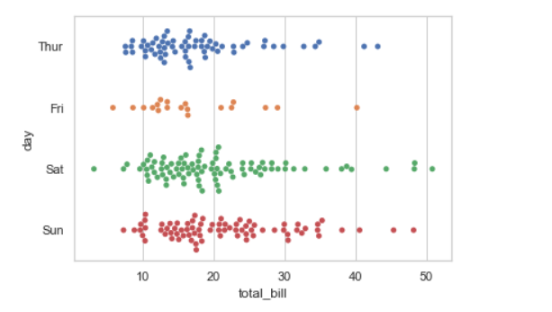
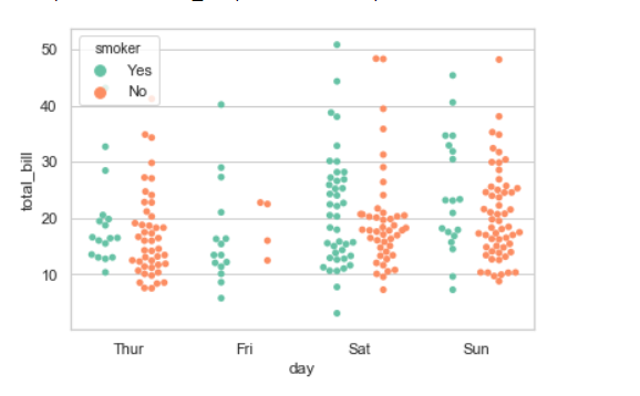
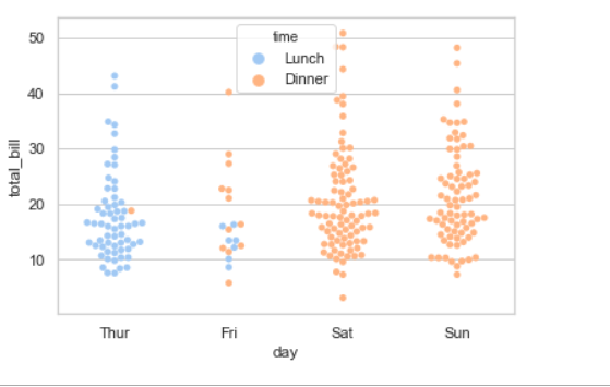
Example 3: Basic visualization of “tips” dataset using swarmplot()
Output:
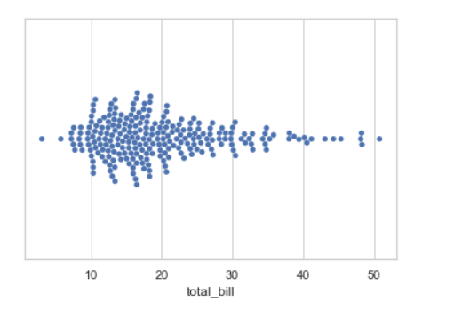
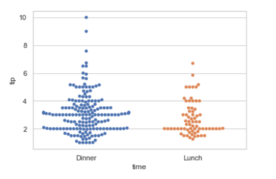
1. Draw a single horizontal swarm plot using only one axis:
If we use only one data variable instead of two data variables then it means that the axis denotes each of these data variables as an axis.
X denotes an x-axis and y denote a y-axis.
Syntax:
seaborn.swarmplot(x)
Output:
2. Draw horizontal swarms:
In the above example we see how to plot single horizontal swarm plot and here can perform multiple horizontal swarm plot with exchange the data variable with another axis.
Output:
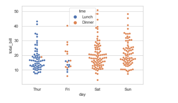
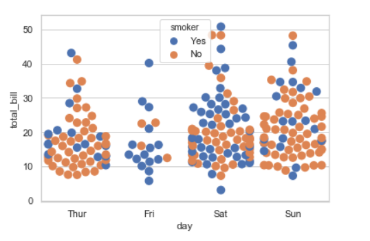
3. Using hue parameter:
While the points are plotted in two dimensions, another dimension can be added to the plot by coloring the points according to a third variable.
Syntax:
sns.swarmplot(x, y, hue, data);
Output:
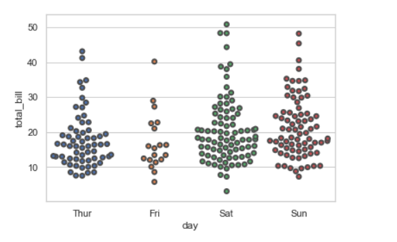
4. Draw outlines around the data points using linewidth:
Width of the gray lines that frame the plot elements. Whenever we increase linewidth than the point also will increase automatically.
Syntax:
seaborn.swarmplot(x, y, data, linewidth)
Output:
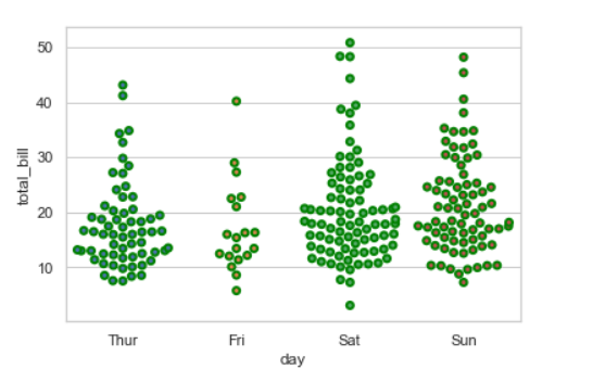
We can change the color with edgecolor:
Output:
5. Draw each level of the hue variable at different locations on the major categorical axis:
When using hue nesting, setting dodge should be True will separate the point for different hue levels along the categorical axis. And Palette is used for the different levels of the hue variable.
Syntax:
seaborn.stripplot(x, y, data, hue, palette, dodge)
Output:
Possible values of palette are:
Accent, Accent_r, Blues, Blues_r, BrBG, BrBG_r, BuGn, BuGn_r, BuPu, BuPu_r, CMRmap, CMRmap_r, Dark2, Dark2_r,
GnBu, GnBu_r, Greens, Greens_r, Greys, Greys_r, OrRd, OrRd_r, Oranges, Oranges_r, PRGn, PRGn_r, Paired, Paired_r,
Pastel1, Pastel1_r, Pastel2, Pastel2_r, PiYG, PiYG_r, PuBu, PuBuGn, PuBuGn_r, PuBu_r, PuOr, PuOr_r, PuRd, PuRd_r,
Purples, Purples_r, RdBu, RdBu_r, RdGy, RdGy_r, RdPu, RdPu_r, RdYlBu, RdYlBu_r, RdYlGn, RdYlGn_r, Reds, Reds_r, Set1,
Set1_r, Set2, Set2_r, Set3, Set3_r, Spectral, Spectral_r, Wistia, Wistia_r, YlGn, YlGnBu, YlGnBu_r, YlGn_r, YlOrBr,
YlOrBr_r, YlOrRd, YlOrRd_r, afmhot, afmhot_r, autumn, autumn_r, binary, binary_r, bone, bone_r, brg, brg_r, bwr, bwr_r,
cividis, cividis_r, cool, cool_r, coolwarm, coolwarm_r, copper, copper_r, cubehelix, cubehelix_r, flag, flag_r, gist_earth,
gist_earth_r, gist_gray, gist_gray_r, gist_heat, gist_heat_r, gist_ncar, gist_ncar_r, gist_rainbow, gist_rainbow_r, gist_stern,
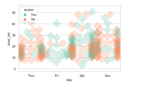
6. Plotting large points and different aesthetics With marker and alpha parameter:
We will use alpha to manage transparency of the data point, and use marker for marker to customize the data point.
Output:
7. Control swarm order by passing an explicit order:
Output:
8. Adding size attributes.
Using size we can generate the point and we can produce points with different sizes.
Syntax:
seaborn.swarmplot( x, y, data, size)
Output:
9. Adding the palette attributes:
Using the palette we can generate the point with different colors. In this below example we can see the palette can be responsible for a generate the swarmplot with different colormap values.
Syntax:
seaborn.swarmplot( x, y, data, palette=”color_name”)
Output: