 |
VOOZH | about |
|
VOOZH | about |
Violin Plot is a method to visualize the distribution of numerical data of different variables. It is similar to Box Plot but with a rotated plot on each side, giving more information about the density estimate on the y-axis. The density is mirrored and flipped over and the resulting shape is filled in, creating an image resembling a violin. The advantage of a violin plot is that it can show nuances in the distribution that aren’t perceptible in a boxplot. On the other hand, the boxplot more clearly shows the outliers in the data.
Violin Plots hold more information than the box plots, they are less popular. Because of their unpopularity, their meaning can be harder to grasp for many readers not familiar with the violin plot representation.
Plotly is an open-source python module that is a very powerful data visualization tool. It supports various plots to represent and study data easily. This article discusses how a violin plot can be obtained using Plotly with the help of its two classes namely- express and graph_objects.
The classes can be chosen as per one's convenience, but the approach remains the same.
Approach:
Function supported by Plotly.express
Syntax:
violin(data_frame=None, x=None, y=None, color=None, facet_row=None, facet_col=None, facet_col_wrap=0, facet_row_spacing=None, facet_col_spacing=None, hover_name=None, hover_data=None, custom_data=None, animation_frame=None, animation_group=None, category_orders=None, labels=None, color_discrete_sequence=None, color_discrete_map=None, orientation=None, violinmode=None, log_x=False, log_y=False, range_x=None, range_y=None, points=None, box=False, title=None, template=None, width=None, height=None)
Function supported by Plotly.graph_objects
Syntax:
Violin(arg, alignmentgroup, bandwidth, box_visible, customdata, customdatasrc, fillcolor, hoverinfo, hoverinfosrc, hoverlabel, hoveron, hovertemplate, hovertemplatesrc, hovertext, hovertextsrc, ids, idssrc, jitter, legendgroup, line, marker, meanline, meta, metasrc, name, offsetgroup, opacity, orientation, pointpos, points, scalegroup, scalemode, selected, selectedpoints, showlegend, side, span, spanmode, stream, text, textsrc, uid, uirevision, unselected, visible, width, x, x0, xaxis, xsrc, y, y0, yaxis, ysrc, **kwargs)
Example 1: Using Plotly.express
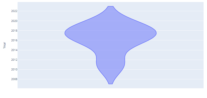
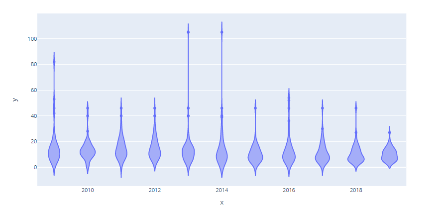
Output:
👁 ImageExample 2: Using Graph_objects
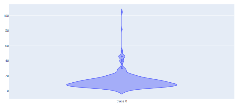
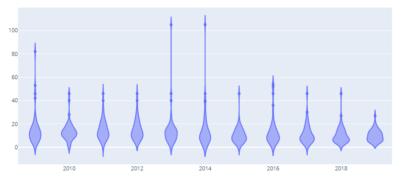
Output:
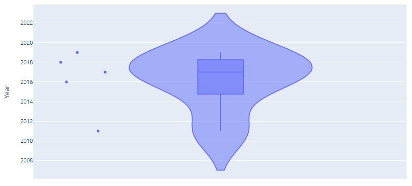
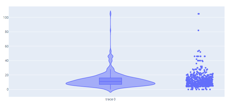
👁 ImageThe above examples depict a simple violin plot but it can be visualized along with other visualization depict within the same frame. The given example shows how a violin plot can be drawn along with box plots and scatter plot.
Example 1: Using Plotly.express
Output:
👁 ImageExample 2: Using graph_objects
Output:
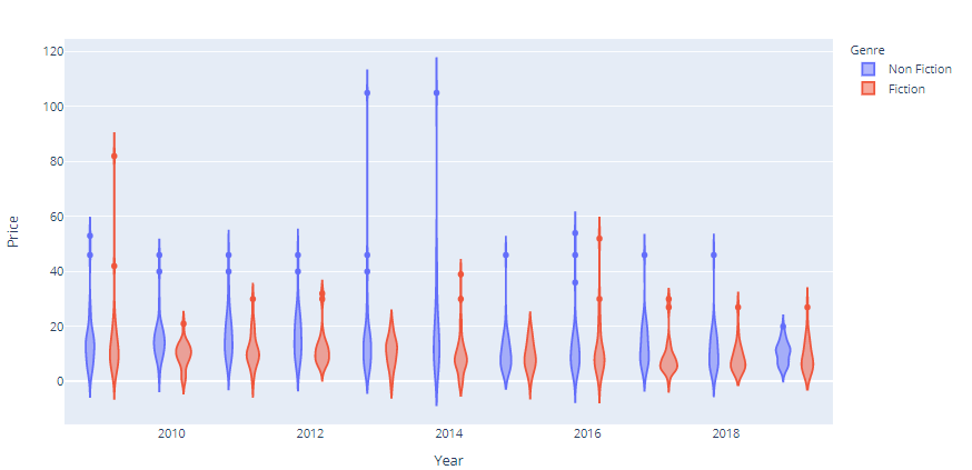
👁 ImageIt is possible using plotly to visualize multiple violin plots in one frame to compare them simultaneously.
Example 1: Using Plotly express
Output:
👁 ImageExample 2: Using graph_objects
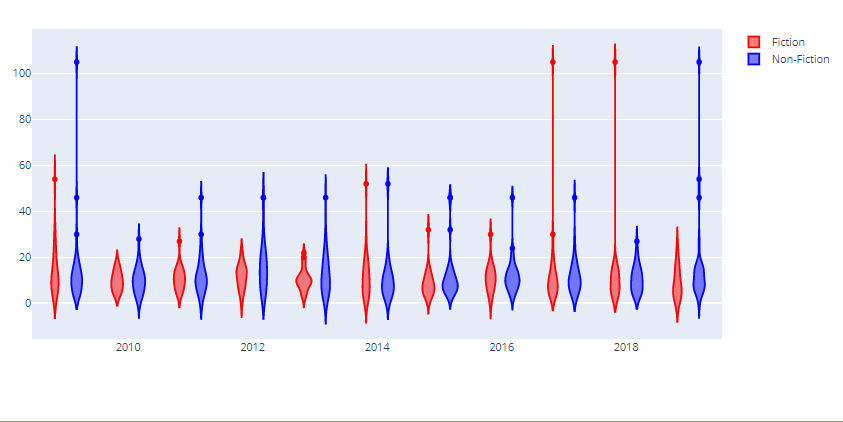
Output:
👁 ImageA grouped violin plot allow comparison of multiple violin plot but which have something in common i.e. it allows comparison of two contemporary violin plots
Example 1: Using Plotly express
Output:
👁 ImageExample 2: Using graph_objects