 |
VOOZH | about |
|
VOOZH | about |
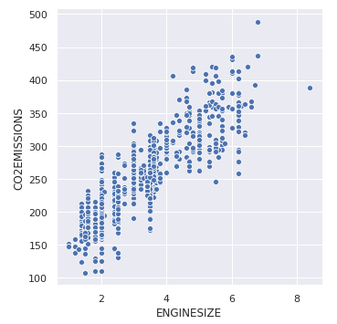
To understand how variables in a dataset are related to one another and how that relationship is dependent on other variables, we perform statistical analysis. This Statistical analysis helps to visualize the trends and identify various patterns in the dataset. One of the functions which can be used to get the relationship between two variables in Seaborn is relplot().
Relplot() combines FacetGrid with either of the two axes-level functions scatterplot() and lineplot(). Scatterplot is default kind of relplot(). Using this we can visualize joint distribution of two variables through a cloud of points. We can draw scatterplot in seaborn using various ways. The most common one is when both the variables are numeric.
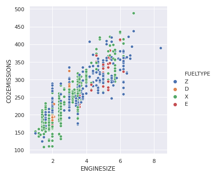
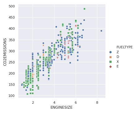
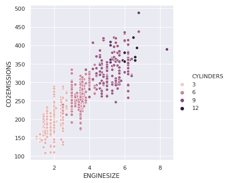
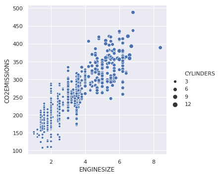
Example: Let's take an example of a dataset that consists a data of CO2 emissions of different vehicles. To get the dataset click here. Let's plot the basic scatterplot for visualizing the relation between the target variable "CO2EMISSIOnS" and "ENGINE SIZE" Output: 👁 Image