Icons are an important part of user interfaces, which are used in expressing objects, actions, and ideas. They are used to communicate the core idea and intent of a product or action. So, they bring a lot of benefits to user interfaces.
Icons are used to present information visually. For example, Instead of writing a text message of instruction over a small button, you just design an icon representing that message. That reduces the space that could have been taken by text message and it provides a cleaner and concise user experience.
So, primarily icon is used to communicate the message very rapidly and effectively.
Types of Icons
Glyph icons: These are symbols and are frequently solid. They can be scaled to whichever size you want and can be customized with different colors and shadow effects. Because they are generally a solid color, icons can work really well at small sizes, but may not behave as required at larger sizes.
Colored icons: These icons have color. They can either have a solid color or a gradient color scheme. The drawback of colored icons is that they can be more challenging to integrate into UI and can even distract users from the main content.
Universal icons: These icons are noticed instantly, and usually represent repetitive actions. Universal actions in any product should be depicted with universal icons to avoid any chaos.
Unique icons: They represent unique features. The drawback of using them is that they are very hard for first-time users to understand. So, make sure that you include text labels when you use them.
Outlined icons: These are created by strokes and are empty from the inside. They are clean and simple but they take users more time to process and recognize.
Conflicting icons: If Multiple icons present the same concept that is conflicting icons.
Key Principles of Icon Design
Keep icons simple and uncluttered.
Ensure icons clearly convey their intended meaning.
Maintain a consistent style within your icon set.
Make icons relevant to their context.
Design icons to work at various sizes.
Keep elements well-aligned and balanced.
Test icons at smaller sizes for readability.
Choose colors carefully for accessibility.
Utilize negative space effectively.
Establish hierarchy within icon sets.
Maintain uniform stroke width.
Gather user feedback and iterate designs.
Follow platform-specific design guidelines.
Creating a Simple Icon in Figma
You can create an icon on any UI design tools like figma, adobeXD etc. I am using Figma to create a simple circular icon. Here, we will understand this with an example.
Note: To generate code out of the created icon in figma use a plugin like anima.
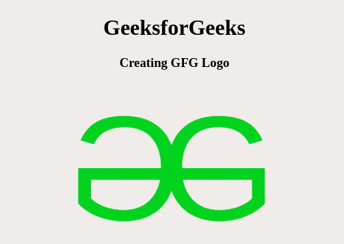
Example: Let us create an icon representing GFG logo.
Converting to code using the figma plugin (anima) going to dev mode results into,
Icons are universal symbols that can communicate complex ideas or actions quickly and more effectively.
Icons simplify information by reducing text which makes content more approachable and less overwhelming.
Icons are language-agnostic, making them perfect for applications and websites targeting a global audience.
Enhanced Usability: Icons can improve the usability of interfaces by making navigation and interaction more easier.
Icons can help in recognizing brands
Icons can enhance accessibility by providing an alternative means of conveying information to those with visual or cognitive impairments.
Icons can be used for quick navigation, allowing users to jump directly to specific sections or actions without the need for extensive text-based menus.
Icons contribute to consistency within a design system or user interface.
Icons are good for small devices with limited screen real estate and they provide a touch-friendly target for interactions, making them suitable for responsive design.
Icons make it easier for users to scan content and quickly identify relevant information or actions.
Icons can aid in memory retention where users are more likely to remember visual symbols than lengthy text descriptions.
Icons are significant. They should serve a purpose. They should help the user do what they need without requiring additional efforts from them. They take up less space on a site than text. It makes the website interface look cleaner and more convenient for eyes.
