 |
VOOZH | about |
|
VOOZH | about |
Interpreting models is an important part of machine learning, especially when dealing with black-box models like XGBoost or deep neural networks. SHAP (SHapley Additive exPlanations) provides a robust and sound method to interpret model predictions by making attributes of importance scores to input features.
SHAP is a method that helps us understand how a machine learning model makes decisions. It tells us how much each input (feature) is helping or hurting the final prediction. The main idea is to fairly distribute the "payout" (the prediction) among all features based on their contribution.
Unlike traditional feature importance techniques, SHAP provides local explanations (per prediction) in addition to global feature importance, making it more versatile.
We demonstrate SHAP with an XGBoost regression model trained on the Abalone dataset to predict the age of abalone based on physical characteristics.
Step 1: Install Required Libraries
Step 2: Load and Prepare the Dataset
X) and target (y = 'Rings').Step 3: Train the XGBoost Regressor
Step 4: Initialize the SHAP Explainer
SHAP (SHapley Additive exPlanations) has a variety of visualization tools that help interpret machine learning model predictions. These plots highlight which features are important and also explain how they influence individual or overall model outputs. Below are some commonly used SHAP visualizations and what they reveal about model behavior:
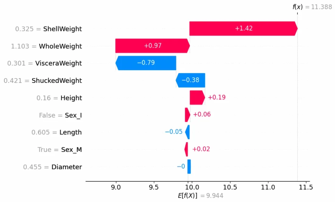
4.1 Waterfall Model
Shows how each feature contributes to the difference between the model's base value and the output prediction for a specific instance.
Output:
Color Guide:
- Red = pushes prediction higher
- Blue = pushes prediction lower
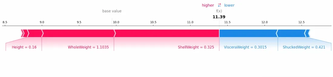
4.2 Force Plot
Gives an interactive view of individual prediction explanations.
Output:
This plot displays the positive and negative influences of features in a linear format.
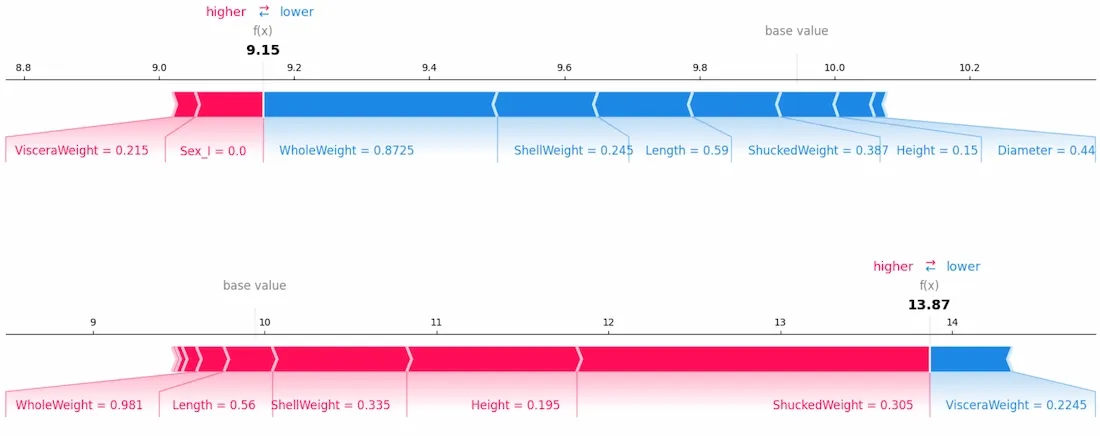
4.3 Stacked Force Plot
Visualizes feature contributions across multiple observations.
Output:
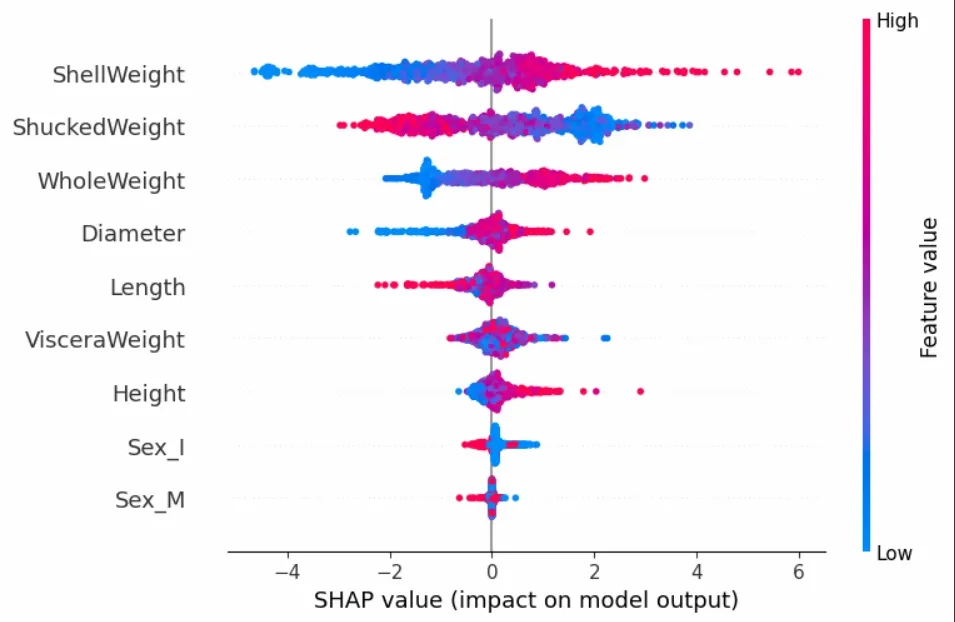
4.4 Summary Plot
Gives a global view of feature importance and how values influence predictions.
Output:
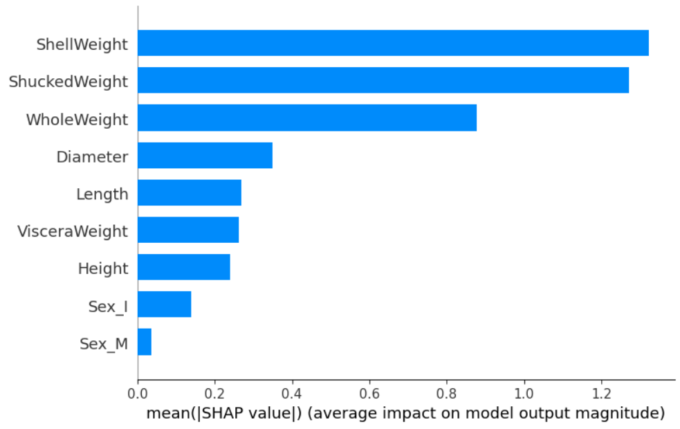
4.5 Bar Plot of Mean SHAP Values
Displays average feature impact across the dataset.
Output:
This is helpful when identifying which features are generally more important.
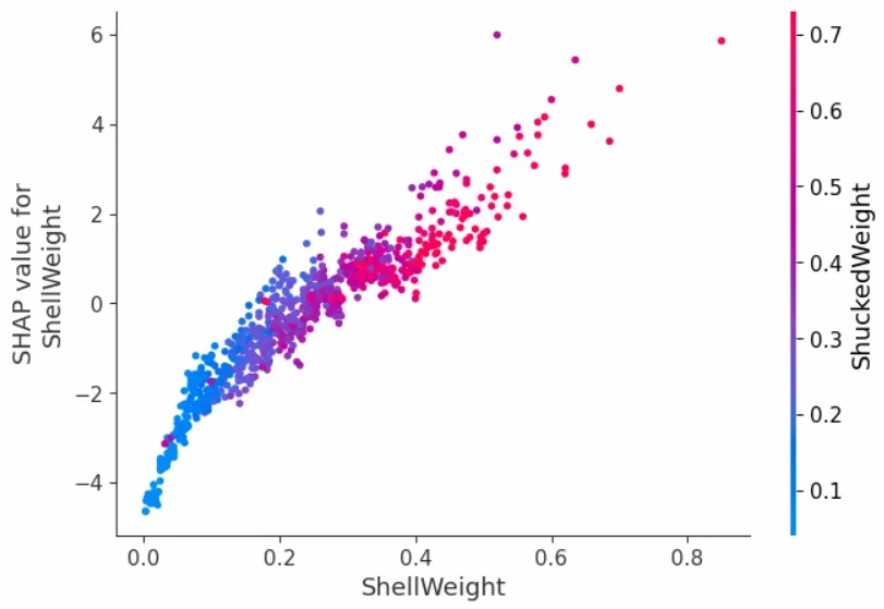
4.6 Dependence Plot
Shows how the SHAP value of a single feature varies with its value.
This helps capture feature interactions as well.
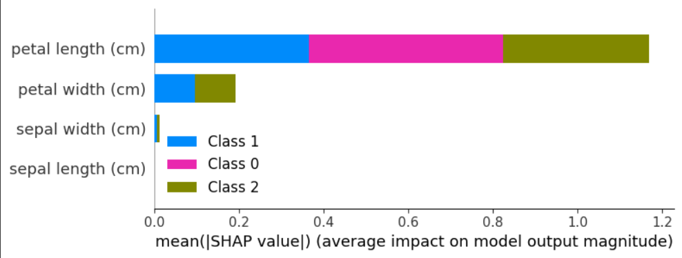
SHAP also supports interpretation of other models like decision trees, random forests, or even neural networks.
Output:
This example shows that SHAP can effectively interpret predictions from even simple models like decision trees, making it a tool for understanding both black-box and transparent models across a wide range of machine learning applications.
| Challenge | Description |
|---|---|
| Computational Overhead | Can be slow for large datasets or complex models |
| High-Dimensional Data | Visualization and computation become difficult |
| Model-Dependent Behavior | Interpretation may vary across different models |
| Resource Consumption | Requires additional time and memory |
| Input Sensitivity | Can be sensitive to feature correlation or data order |
In summary, SHAP is a powerful tool that helps us see which parts of our data matter the most in making predictions. It works for different kinds of models and shows us clear pictures to make things easier to understand. This makes it really useful for people who want to better understand their complicated models.