 |
VOOZH | about |
|
VOOZH | about |
A 3D Scatter Plot is a mathematical diagram that visualizes data points in three dimensions, allowing us to observe relationships between three variables of a dataset. Matplotlib provides a built-in toolkit called mplot3d, which enables three-dimensional plotting. To create a 3D Scatter Plot, we use the ax.scatter3D() function from Matplotlib's mplot3d module. This function requires three sets of values—X, Y, and Z coordinates—to define the position of each point in the 3D space. Example:
The following example demonstrates how to create a simple 3D scatter plot using ax.scatter3D().
Output:
Explanation: In this example, we generate three sets of random data and use scatter3D() to visualize them in a 3D space. The points are marked in red with circular markers.
Before proceeding, ensure you have Matplotlib installed. If not, install it using:
pip install matplotlib
Now, let's explore various examples to understand how 3D scatter plots work.
To enhance visualization, we can use color mapping based on the Z-values of the data points.
Output:
Explanation: In this example, colors of the points are assigned based on the Z-values using the viridis colormap, making it easier to interpret variations in the dataset.
To improve visualization, we can use different markers and vary the size of the points based on another dataset.
Output:
Explanation: Here, we adjust marker sizes randomly to improve visualization and use the coolwarm colormap to enhance the color distribution.
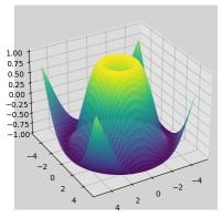
This example demonstrates how to create a 3D surface plot using matplotlib and numpy while incorporating customization options to enhance visualization. The code plots a 3D function and applies various modifications, such as adjusting the viewing angle, enabling the grid and changing the background color.
Output:
Explanation: This code creates a 3D surface plot using Matplotlib. It generates X, Y coordinates using meshgrid. The surface is plotted with a viridis colormap. Customizations include adjusting the viewing angle, enabling the grid and changing the background color for better visualization.