 |
VOOZH | about |
|
VOOZH | about |
Sometimes, when you create a plot default axes X and Y may not show the full picture you want. Changing the axes limits helps you focus on specific data ranges or improve how your plot looks. There are two methods available in Axes module tochange the limits:
Syntax:
Axes.set_xlim(self, left=None, right=None, emit=True, auto=False, *, xmin=None, xmax=None)
Axes.set_ylim(self, bottom=None, top=None, emit=True, auto=False, *, ymin=None, ymax=None)
Parameters:
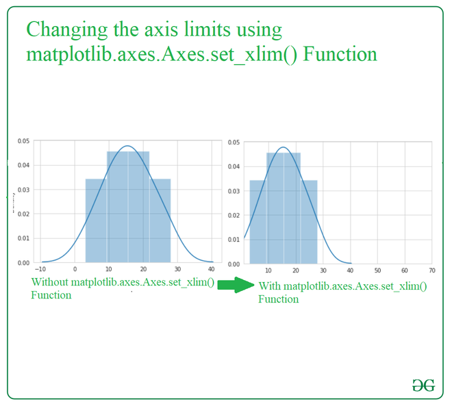
bottom and top. It will generate error if wepass both xmin/ymin and bottom or xmax/ymax and top.Here ax.set_xlim(1, 70): This sets the limits for the x-axis(1- lower bound and 70 -upper bound )
Output:
👁 ImageNow lets see the implementation for matplotlib.axes.Axes.set_ylim().
Here we will load the "tips" dataset which is a built-in dataset in Seaborn. It contains information about restaurant bills and tips. Here gfg.set_ylim(0, 80) sets the y-axis limits and will range from 0 to 80 regardless of the data's actual range.
Output:
👁 ImageChanging axes limits in Seaborn is a simple yet essential technique for customizing your visualizations. By adjusting the X and Y axis ranges, you can focus on specific areas of interest in your data, highlight important trends and improve overall clarity of your plots.