 |
VOOZH | about |
|
VOOZH | about |
Plotting multiple dataframes in subplots is a powerful technique in data visualization, especially when comparing trends or patterns across different datasets. This approach allows you to display multiple plots within a single figure, making it easier to analyze relationships and differences between datasets.
Plotting multiple dataframes in subplots involves creating a single figure that contains multiple smaller plots, each representing data from different dataframes. Each subplot can showcase different aspects of the data, facilitating comparisons and insights.
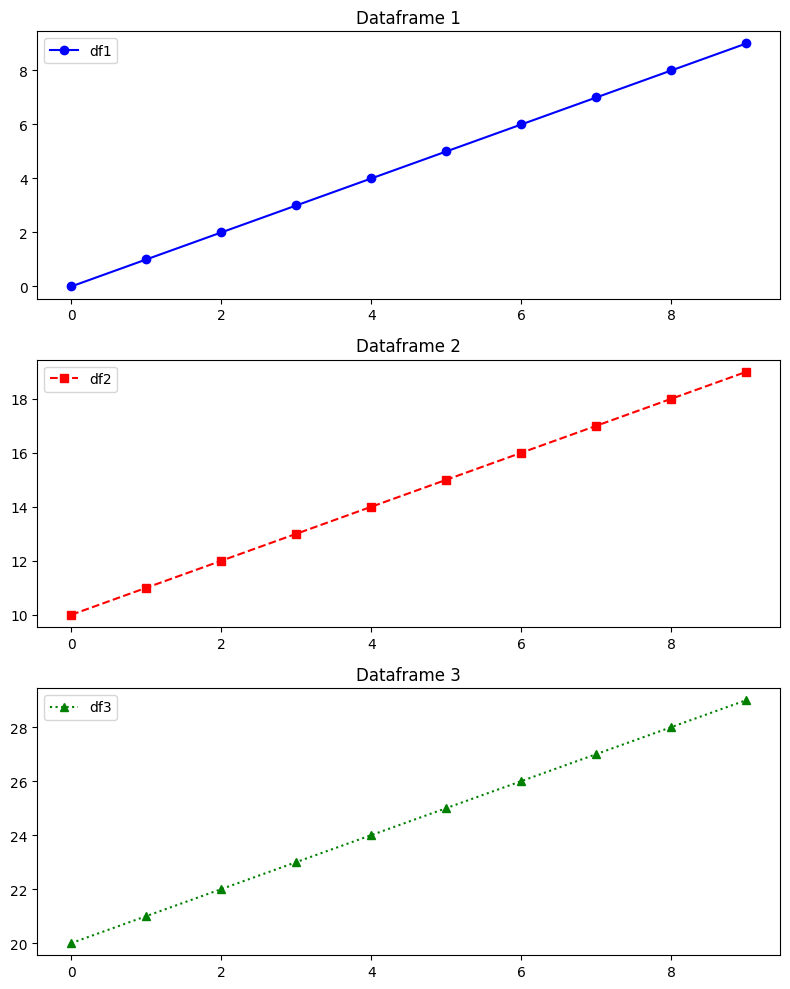
In this example, we'll plot line graphs from different dataframes in subplots using Matplotlib. This example demonstrates how to plot line graphs from different dataframes in separate subplots using Matplotlib. Each subplot represents data from a distinct dataframe (df1, df2, and df3). The plots use different markers, linestyles, and colors to distinguish between datasets
Output
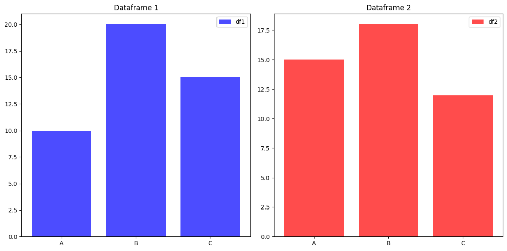
This example demonstrates how to create bar plots from multiple dataframes in subplots. In this example, bar plots are created in separate subplots for two different dataframes (df1 and df2). Each subplot displays categorical data (category vs. values) using bars of different colors. Subplot titles and legends are utilized to differentiate between the two datasets (df1 and df2).
Output
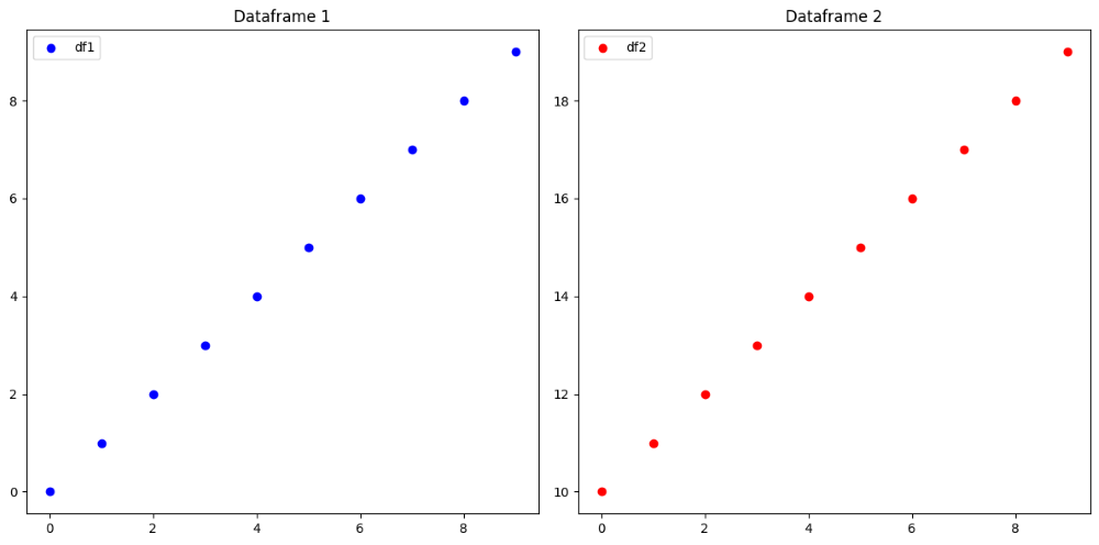
In this example, we'll create scatter plots from multiple dataframes in subplots. This example showcases scatter plots from two different dataframes (df1 and df2) in separate subplots. Each subplot visualizes relationships between variables (x vs. y1 for df1 and x vs. y2 for df2) using different marker colors. Subplot titles and legends are included to distinguish between the datasets (df1 and df2)
Output
Plotting multiple dataframes in subplots enhances data visualization by enabling side-by-side comparisons of different datasets. Whether using line plots, bar plots, or scatter plots, the ability to plot dataframes in subplots helps in analyzing trends, relationships, and patterns effectively. By leveraging libraries like matplotlib, you can create insightful visualizations that aid in data exploration and decision-making processes.