 |
VOOZH | about |
|
VOOZH | about |
Altair is a declarative statistical visualization library in Python, designed to make it easy to create clear and informative graphics with minimal code. Built on top of Vega-Lite, Altair focuses on simplicity, readability and efficiency, making it a favorite among data scientists and analysts.
Unlike imperative libraries such as matplotlib or seaborn, where you must specify how every element of the plot should be constructed, Altair allows you to focus on what you want to visualize the data and its relationships. This declarative approach:
Altair can be installed like any other Python library using:
pip install altair
We’ll also use datasets from the vega_datasets package. To install it:
pip install vega_datasets
Note: Altair visualizations render using JavaScript. It's best to use Jupyter Notebook, JupyterLab, VSCode Notebooks, or any notebook-supported IDE to visualize charts.
All altair charts need three essential elements: Data, Mark and Encoding. A valid chart can also be made by specifying only the data and mark. The basic format of all altair chart is:
alt.Chart(data).mark_bar().encode(
encoding1 = 'column1',
encoding2 = 'column2',
)
Altair is built to work seamlessly with Pandas DataFrames, making data encoding intuitive and straightforward. When you create a chart, the first argument is usually your dataset. While DataFrames are recommended for ease of use, Altair also supports other data formats:
Example:
In Altair, the mark defines how your data should be visually represented such as bars, lines, points, or areas. It is one of the essential components of any Altair chart. You specify a mark using the .mark_*() method, where * is the type of visualization you want.
Common Mark Types
Mark Type | Description |
|---|---|
mark_bar() | Bar chart (for categorical data) |
mark_line() | Line chart (for trends over time) |
mark_point() | Scatter plot (for dot data points) |
mark_area() | Area chart (for cumulative values) |
mark_tick() | Tick marks (minimalist visuals) |
mark_text() | Display text on the chart |
Example:
Encoding in Altair maps data columns to visual properties using .encode(). Common channels include x and y for axes, color, size, shape and opacity for styling, tooltip for hover info, row/column for faceting, href for links and text for labels. Type hints guide Altair in interpreting data:
Output
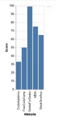
Explanation: Chart is initialized with alt.Chart(d), the bar type is set using .mark_bar() and the axes are encoded with ‘Website’ on the x-axis and ‘Score’ on the y-axis. Displaying the chart renders bars that represent the scores for each website.
Output
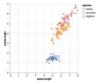
Explanation: Chart is initialized with alt.Chart(iris) and .mark_point() to create a scatter plot. encode() maps sepalLength to the x-axis, petalLength to the y-axis and uses shape and color to distinguish species. Tooltips provide interactive details on hover.
Example 3: Line Chart (Temporal Data)
Output
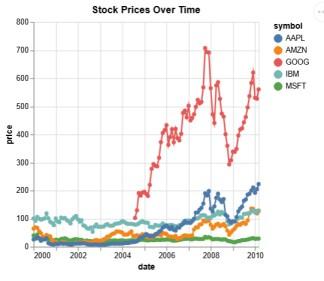
Explanation: The stocks dataset is visualized as a line chart using mark_line(point=True). Time (date) is encoded on the x-axis and stock price on the y-axis. Different symbols (stock names) are colored distinctly.
Example 4: Faceted Bar Chart
Output
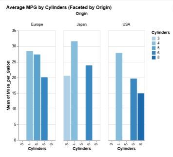
Explanation: Chart is created with alt.Chart(cars) and .mark_bar() to show bars. Cylinders is mapped to the x-axis, average M, andiles_per_Gallon to the y-axis and bars are colored by cylinder count. Faceting by Origin enables regional comparison.