 |
VOOZH | about |
|
VOOZH | about |
Line plots are important data visualization elements that can be used to identify relationships within the data. Using matplotlib.pyplot.plot() function we can plot line plots. Styling tools in this helps us customize line plots according to our requirements which helps in better representations.
Below are the available line styles present in Matplotlib.
Character | Definition |
- | Solid line |
-- | Dashed line |
-. | dash-dot line |
: | Dotted line |
. | Point marker |
Marker represent various points and shape markers in Matplotlib.
Character | Definition |
o | Circle marker |
, | Pixel marker |
v | triangle_down marker |
^ | triangle_up marker |
< | triangle_left marker |
> | triangle_right marker |
1 | tri_down marker |
2 | tri_up marker |
3 | tri_left marker |
4 | tri_right marker |
s | square marker |
p | pentagon marker |
* | star marker |
h | hexagon1 marker |
H | hexagon2 marker |
+ | Plus marker |
x | X marker |
D | Diamond marker |
d | thin_diamond marker |
| | vline marker |
_ | hline marker |
Color code abbreviations that can be used with line styles.
Codes | Description |
|---|---|
b | blue |
g | green |
r | red |
c | cyan |
m | magenta |
y | yellow |
k | black |
w | white |
Below are some examples by which we line plot styles in Matplotlib in Python:
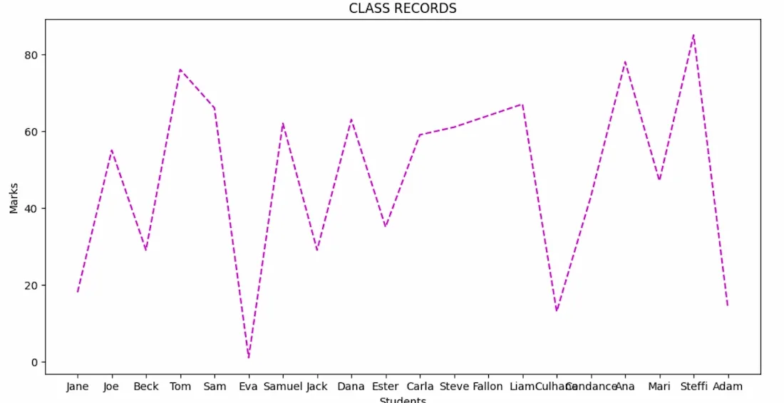
In this example, we will visualize marks of 20 students in a class. Each student's name is paired with a randomly generated mark and a dashed magenta line graph representing the distribution of these marks.
Output:
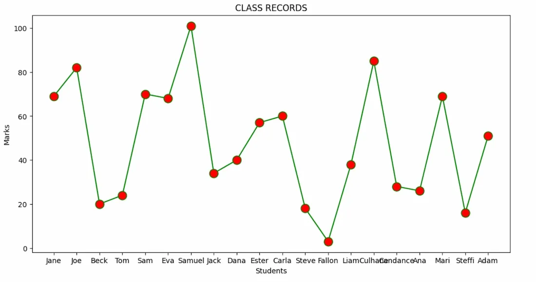
In same above example where each student's name is plotted against their corresponding mark and the line is solid green and data points are marked with red circles. By this example we can understand how to change line styles and markers in Matplotlib.
Output:
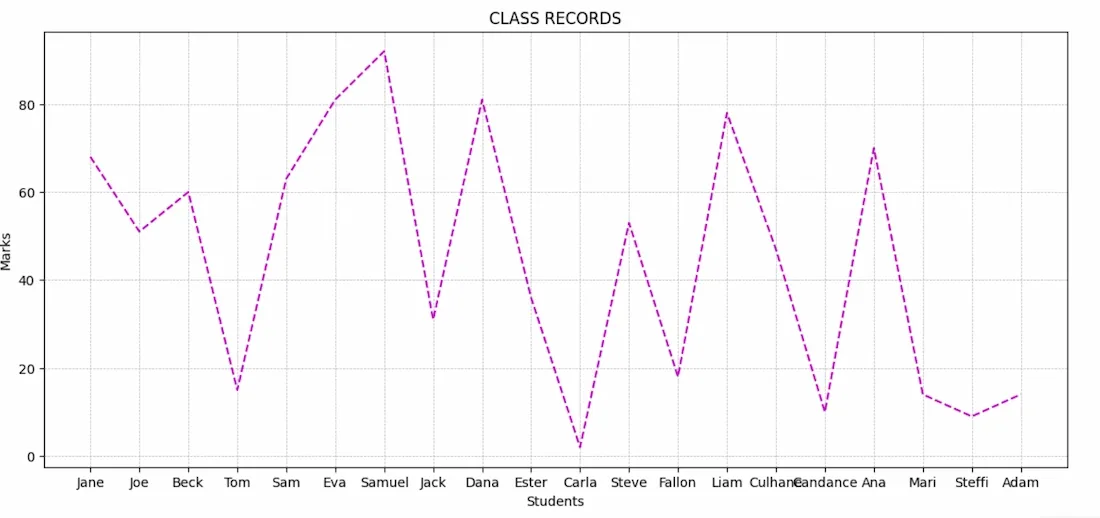
Here the marks are displayed using a dashed magenta line graph. Grid lines are added to provide better readability and reference across the plot.
Output:
We can identify trends and patterns in our data by using multiple styling features including line styles, markers and colors together with gridlines for better understanding of data.