 |
VOOZH | about |
|
VOOZH | about |
The matplotlib.pyplot.colorbar() function in Python adds a color scale (color bar) to a plot, helping to interpret the relationship between data values and colors in colormapped plots like imshow(), scatter() or contourf(). Let us see an example to understand this better:
Output
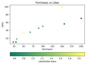
Explanation: This example creates a scatter plot where the x-axis represents purchase counts and the y-axis represents likes. The color of each point corresponds to a "Like/Dislike Ratio," mapped using the summer colormap. A horizontal colorbar is added to indicate the color mapping of the ratio values.
matplotlib.pyplot.colorbar(mappable=None, cax=None, ax=None, **kwargs)
Parameters:
Common kwargs Properties:
Returns: The function returns a colorbar, which is an instance of the matplotlib.colorbar.Colorbar class.
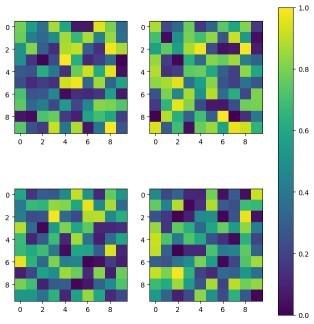
Example 1: This example demonstrates how to display multiple image plots in a grid layout while using a single, shared colorbar for all subplots.
Explanation: Here, a 2x2 grid of subplots is created, where each subplot contains an image plot generated from random values. Instead of adding individual colorbars to each subplot, a single shared colorbar is applied across all plots using ax=axes.ravel().tolist(), ensuring consistent color mapping.
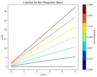
Example 2: This example shows how to attach a colorbar to plot elements (like lines) that don’t directly support colormaps by using a ScalarMappable.
Output
Explanation: In this case, multiple lines are plotted using different colors from the 'jet' colormap. Since the lines themselves are not directly associated with a colormap, a ScalarMappable object is created with a normalized range of values.
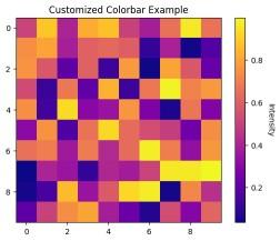
Example 3: This example demonstrates how to customize the appearance of a colorbar, including its label orientation and tick styling.
Output
Explanation: A 10x10 grid of random intensity values is displayed using imshow() and a customized colorbar is added. The colorbar's label is rotated by 270 degrees and positioned with a label padding of 15. The tick labels on the colorbar are adjusted for better readability using tick_params().
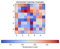
Example 4: This example shows how to change the orientation of a colorbar from vertical to horizontal for better layout flexibility.
Output
Explanation: This example generates a heatmap using imshow() with the coolwarm colormap. Instead of the default vertical orientation, the colorbar is set to be horizontal using orientation='horizontal', with an appropriate label indicating the temperature scale.