 |
VOOZH | about |
|
VOOZH | about |
The matplotlib.pyplot.plot() is used to create 2D plots such as line graphs and scatter plots. The plot() function allows us to plot data points, customize line styles, markers and colors making it useful for various types of visualizations. In this article, we'll see how to use this function to plot data in Python.
Syntax: matplotlib.pyplot.plot(*args, scalex=True, scaley=True, data=None, **kwargs)
Parameters:
Returns: A list of Line2D objects each representing a segment of the plotted data.
There are many ways of creating plot using Matplotlib.pyplot.plot() function some of their examples are:
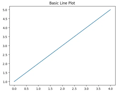
Here we use Matplotlib's plot() function to create a simple line plot with the data [1, 2, 3, 4, 5].
Output:
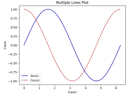
We will plot sine and cosine functions on the same graph.
Output:
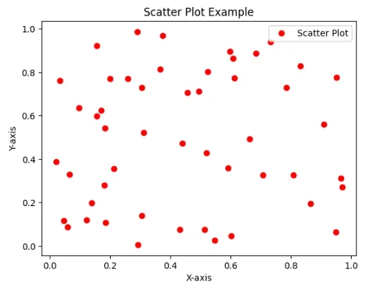
We will generate and customize scatter plot with 50 random data points featuring red circular markers.
Output:
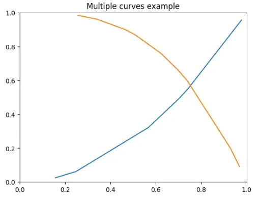
We are creating a line plot with two curves: a blue curve and an orange curve generating data randomly. The plot is limited to the range [0, 1] on both axes showcasing a visual representation of mathematical functions.
Output:
With the flexibility to customize line styles, markers and colors Matplotlib's plot() function provides various possibilities for visualizing our data in Python.