 |
VOOZH | about |
|
VOOZH | about |
In this article, we’ll explore how to plot multiple time series from Pandas DataFrames into a single plot. When working with multiple time series, the most important factor is ensuring that their indexes (usually DateTime indexes) are aligned. We’ll cover two common scenarios:
When multiple time series share the same DateTime index, plotting them together is straightforward. Since their timestamps are already aligned, you can directly call .plot() on the DataFrame or individual columns to visualize them on a single graph.
First, import the required libraries. pandas manages the data, while matplotlib.pyplot handles plotting. plt.style.use('default') sets a clean style and %matplotlib inline (for Jupyter) ensures plots render within the notebook.
We will be plotting open prices of three stocks Tesla, Ford, and general motors, You can download the data from here or yfinance library.
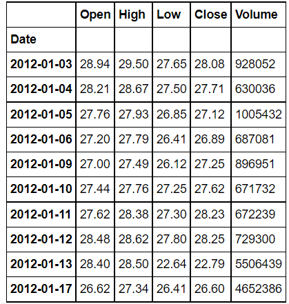
Tesla file:
Output
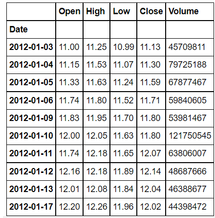
👁 ImageFord_stock:
Output
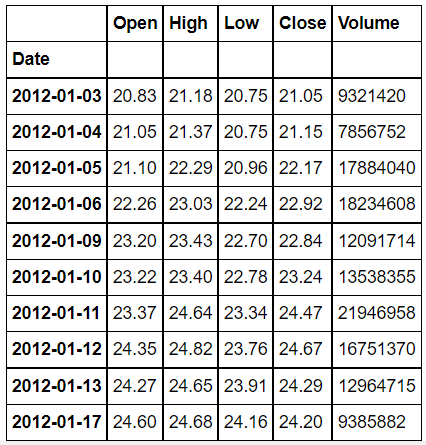
👁 ImageGM_Stock:
Output
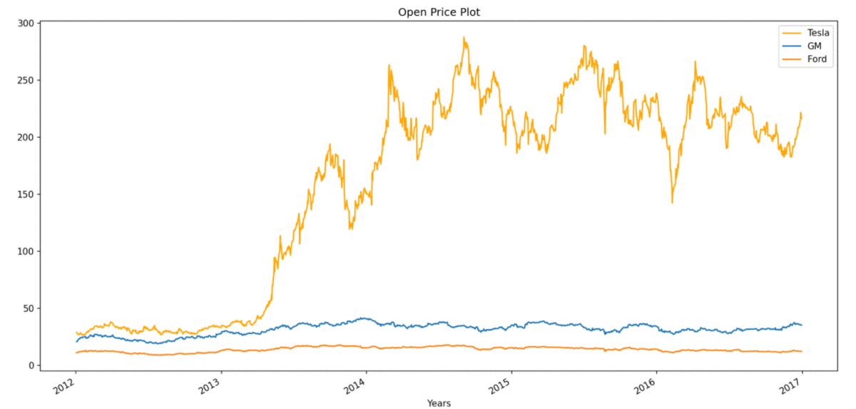
👁 ImageSince the time series share the same DateTime index, plotting is straightforward. You can directly call .plot() on the 'Open' column of each DataFrame to overlay them.
Output
👁 ImageExplanation: Since all three stocks have the same DateTime index, their data aligns perfectly across time. This allows us to directly call .plot() on each DataFrame’s 'Open' column without any preprocessing.
When time series DataFrames have different DateTime indexes, direct plotting can result in misaligned or incomplete data. To visualize them together accurately, you first need to align their indexes, typically by reindexing one DataFrame to match the other before plotting.
First, import the required libraries. pandas manages the data, while matplotlib.pyplot handles plotting. plt.style.use('default') sets a clean style and %matplotlib inline (for Jupyter) ensures plots render within the notebook.
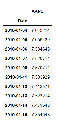
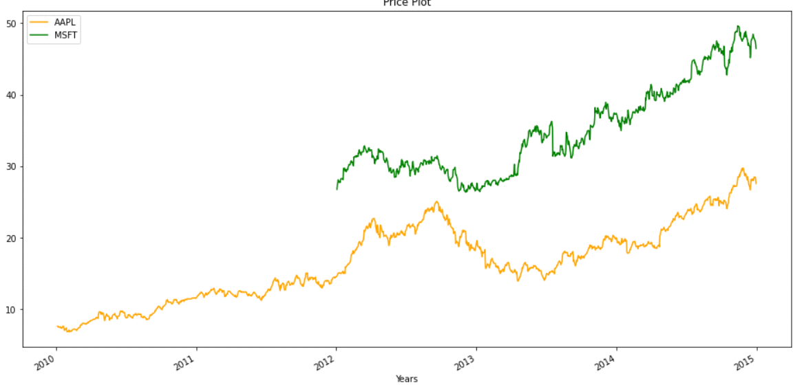
Here we load Apple (AAPL) and Microsoft (MSFT) stock price data, which have different date ranges.
Output
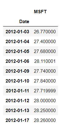
👁 Imagemsft file:
Output
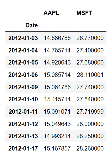
👁 ImageSince their DateTime indexes do not completely overlap, we merge Microsoft’s prices into Apple’s DataFrame based on the Date index. This creates missing values where dates do not match.
Output
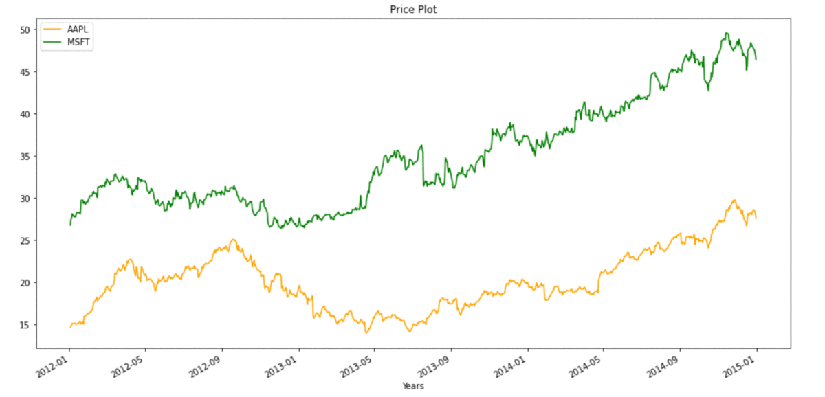
👁 ImageOnce the DateTime indexes of both time series are aligned and missing values handled, we can now plot them together. This visual representation allows for easy comparison of stock performance over time.
Output
👁 ImageExplanation: Apple and Microsoft data have different date ranges. When we merge them by index, gaps (NaNs) appear where one stock has data but the other does not. We handle this by using dropna() before plotting, ensuring clean, aligned visuals.
In some cases we can't afford to lose data, so we can also plot without removing missing values, plot for the same will look like:
👁 Image