 |
VOOZH | about |
|
VOOZH | about |
Visualizing data involving three variables often requires three-dimensional plotting to better understand complex relationships and patterns that two-dimensional plots cannot reveal. Python’s Matplotlib library, through its mpl_toolkits.mplot3d toolkit, provides powerful support for 3D visualizations. To begin creating 3D plots, the first essential step is to set up a 3D plotting environment by enabling 3D projection on the plot axes. For example:
Output
Explanation:
A 3D line plot connects points in three-dimensional space to visualize a continuous path. It's useful for showing how a variable evolves over time or space in 3D. This example uses sine and cosine functions to draw a spiraling path.
Output
Explanation: We generate 100 points between 0 and 1 using np.linspace() for z, then compute x = z * np.sin(25z) and y = z * np.cos(25z) to form a spiral. The 3D spiral is plotted using ax.plot3D(x, y, z, 'green').
A 3D scatter plot displays individual data points in three dimensions, helpful for spotting trends or clusters. Each dot represents a point with (x, y, z) values and color can be used to add a fourth dimension.
Output
Explanation: Using the same x, y and z values, ax.scatter() plots individual 3D points. Colors are set by c = x + y, adding a fourth dimension to visualize variation across points.
Surface plots show a smooth surface that spans across a grid of (x, y) values and is shaped by z values. They’re great for visualizing functions with two variables, providing a clear topography of the data.
Output
Explanation: We create a grid with x and y using np.outer() and .T, then compute z = np.cos(x**2 + y**3). The surface is visualized with ax.plot_surface() using cmap='viridis' for color and edgecolor='green' for gridlines.
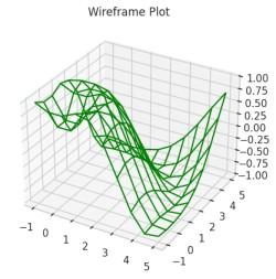
A wireframe plot is like a surface plot but only shows the edges or "skeleton" of the surface. It’s useful for understanding the structure of a 3D surface without the distraction of color fill.
Output
Explanation: We define f(x, y) = sin(√(x² + y²)), generate a meshgrid for x and y, and compute z values. Using ax.plot_wireframe(), we render the 3D surface as a green wireframe.
This plot combines a 3D surface with contour lines to highlight elevation or depth. It helps visualize the function’s shape and gradient changes more clearly in 3D space.
Output
Explanation: We define fun(x, y) = sin(√(x² + y²)) and generate a dense grid for x and y. The surface is plotted with ax.plot_surface() using alpha=0.8 for transparency and axis labels are added for clarity.
This plot uses triangular meshes to build a 3D surface from scattered or grid data. It's ideal when the surface is irregular or when using non-rectangular grids.
Output
Explanation: After defining the function and generating x and y with np.meshgrid(), we flatten them using .ravel() and create a Triangulation object. The surface is plotted with ax.plot_trisurf() using a colormap and transparency.
A Möbius strip is a one-sided surface with a twist—a famous concept in topology. This plot visualizes its 3D geometry, showing how math and art can blend beautifully.
Output
Explanation: We generate parameters u and v to span the circle and strip width, mesh them and compute x, y and z using parametric equations. The twisted strip is plotted with ax.plot_surface() using transparency and custom axis limits.