 |
VOOZH | about |
|
VOOZH | about |
Bootstrap 5's grid system is a powerful tool for creating responsive layouts. It utilizes a 12-column system that adapts to various screen sizes, making it easier to design websites that look great on all devices. Let's dive deeper into how the grid system works across all breakpoints.
Key Concepts:
1. Containers: The outermost element that houses the grid.
2. Rows: Horizontal groups of columns.
3. Columns: The basic building blocks of the grid system.
4. Breakpoints: Points at which the layout adjusts based on screen size.
Prerequisite:Grid System in Bootstrap 5.
Breakpoints in Bootstrap 5:
Bootstrap 5 defines six breakpoints:
Using the Grid System:
1. Equal-width Columns: To create columns of equal width across all breakpoints, use the .col class
2. Specific Column Widths: To set specific column widths, use .col-* where * is a number from 1 to 12
3. Responsive Breakpoints: To adjust column widths at specific breakpoints, use classes like .col-sm-*, .col-md-*, etc.
4. Auto-layout Columns: For flexibly sized columns, use .col-auto
5. Nesting: Grids can be nested within columns
6. Offset Columns: Use .offset-* classes to move columns to the right
Best Practices:
1. Always start with mobile-first design, then scale up.
2. Use the appropriate breakpoint classes to ensure your layout looks good on all devices.
3. Leverage the flexibility of auto-layout columns when possible.
4. Test your layouts across different screen sizes to ensure responsiveness.
Below are the examples for Bootstrap 5 Grid System
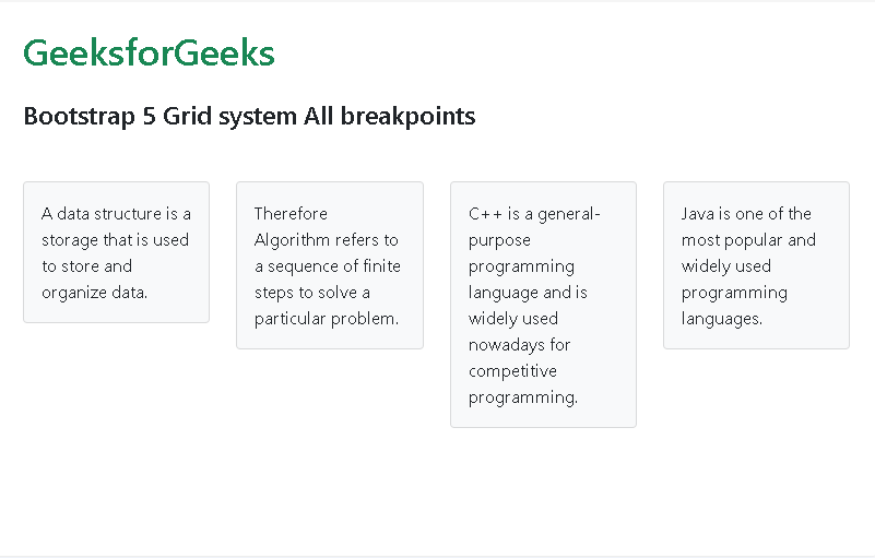
Example 1: The example below demonstrates the cards which takes up the same column space and stays that way in all the breakpoints:
Output:
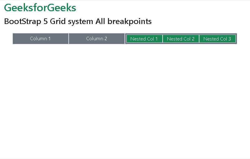
Example 2: The example code demonstrates how you can give different width to individual column and also how even nested Grid can have same width in all breakpoints:
Output:
Reference:https://getbootstrap.com/docs/5.0/layout/grid/#all-breakpoints