 |
VOOZH | about |
|
VOOZH | about |
Bootstrap 5 is the latest major release by Bootstrap in which they have revamped the UI and made various changes. List groups are a flexible and powerful component for displaying a series of content. These can be modified and extended to support just about any content within. Use .list-group and .list-group-item classes to create a list of items. The .list-group class is used with <ul> element and .list-group-item is used with <li> element.
Syntax:
<div class="list-group"> Contents... <div>Table of Content
The .list-group class is used with <ul> element and .list-group-item is used with <li> element.
Syntax:
<ul class="list-group">
 <li class="list-group-item">An item</li>
 <li class="list-group-item active" aria-current="true">An active item</li>
 <li class="list-group-item disabled" aria-disabled="true">A disabled item</li>
 <a href="#" class="list-group-item list-group-item-action active" aria-current="true">
 The current link item
 </a>
</ul>
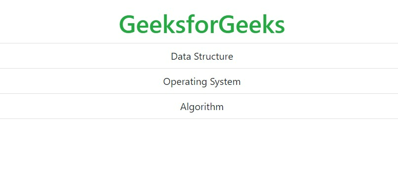
Example: This example demonstrates creating a list using list-group-item.
Output:
👁 ImageThe .active class is used to highlight the current item.
Example:
Output:
👁 ImageUse <div> and <a> tag instead of <ul> and <li> to create a list of group with linked items. The .list-group-item-action class is used to set the hover effect to change the background color to gray.
Example:
Output:
👁 ImageThe .disabled class is used to disable the text content. This class set the text color to light. When used on links, it will remove the hover effect.
Example:
Output:
👁 ImageThe .list-group-flush class is used to remove some borders and rounded corners.
Example:
Output:
👁 ImageThe .list-group-horizontal class is used to display the list of items horizontally instead of vertically.
Example:
Output:
👁 ImageIt is used to set the color to the list of items. The classes for coloring the list-items are: .list-group-item-success, .list-group-item-secondary, .list-group-item-info, .list-group-item-warning, .list-group-item-danger, .list-group-item-primary, .list-group-item-dark and .list-group-item-light.
Example:
Output:
👁 ImageThe contextual classes can be used with list of items.
Example:
Output:
👁 ImageThe .badge class can be combined with the utility class to add badges inside the list of groups.
Example:
Output:
👁 Image
.png)
.png)
.png)
.png)
.png)
.png)
.png)
.png)