 |
VOOZH | about |
|
VOOZH | about |
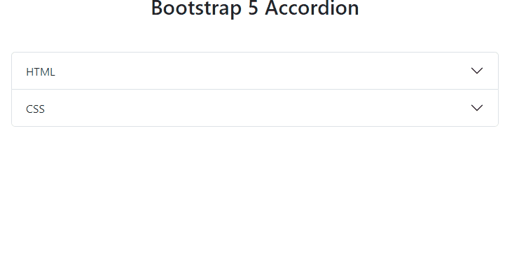
Bootstrap 5 Accordion organizes content into collapsible panels, enabling space-efficient presentation of information. It allows users to toggle between panel visibility, enhancing user experience, and content organization within web applications.
| Term | Description |
|---|---|
| Flush | Adding the .accordion-flush class removes default background color, borders, and some rounded corners from accordions, rendering them edge-to-edge with their parent container. |
| Always Open | Omitting the data-bs-parent attribute makes accordion items stay open when another item is opened. |
| SASS | Changing default accordion values using Bootstrap 5 SASS variables. |
<div class="accordion" id="myAccordion">
 <div class="accordion-item">
 <h2 class="accordion-header" id="header1">
 <button class="accordion-button" type="button"
 data-bs-toggle="collapse"
 data-bs-target="#panel1Collapse">
 First Panel
 </button>
 </h2>
 <div id="panel1Collapse"
 class="accordion-collapse collapse show"
 aria-labelledby="panel1Heading">
 <div class="accordion-body">
 This is the content for first Panel.
 </div>
 </div>
 </div>
 <!-- Add your more panels here -->
</div>
Example 1: Below example demonstrates the usage of the flush accordion. The flush accordion removes the default border and background styles, creating a sleek and borderless appearance.
Output:
Example 2: The below example demonstrates the usage of an accordion that is always open. The always-open accordion allows multiple panels to be open simultaneously, providing a different user experience compared to the default behavior.
Output: