 |
VOOZH | about |
|
VOOZH | about |
Bootstrap 5 Popovers Provides directional placement options (top, bottom, left, right), dismiss on click, and support for disabled elements. Styled with Sass, they feature various methods, options, and events for dynamic interaction and customization.
Bootstrap 5 Popovers:
| Aspect | Description |
|---|---|
| Four directions | The popover can be placed on the top, bottom, left, or right of the element using the data-bs-placement attribute. By default, it is placed on the top. |
| Dismiss on click | The popover can be dismissed on the next click by adding the data-bs-trigger="focus" attribute. |
| Disabled elements | To show a popover message on disabled elements, use data-bs-trigger="hover focus" so that the popover appears when the user hovers over the element. |
| Sass | Sass is a pre-processor scripting language for CSS. It allows manipulation of popover styles using variables and is compatible with all CSS versions. |
| Usage | The popover JavaScript code is inserted into the popover element after triggering it. It generates the popover header and content. |
| Options | Popover options can be passed through data attributes or JavaScript. |
| Methods | Methods add functionality to popover elements. Available methods include: show, hide, toggle, dispose, enable, disable, toggleEnabled, update, getInstance, and getOrCreateInstance. |
| Events | Events are triggered when corresponding methods are called. Events include: show.bs.popover, shown.bs.popover, hide.bs.popover, hidden.bs.popover, and inserted.bs.popover. |
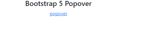
Example 1: In this example Bootstrap 5 Popover integrated via data attributes and JavaScript, enabling dynamic interaction and styling. Utilizes Bootstrap's Popover component for tooltips and interactive content display with ease.
Output:
Example 2: In this example Bootstrap 5 Popover integrated with data attributes for trigger and content placement. Utilizes JavaScript for initialization, enabling interactive tooltips on disabled elements.
Output: