Bootstrap 5 provides ratios, which can be used to create fixed-ratio containers. These containers maintain a specific aspect ratio, regardless of the size of the screen or the content within them.
Bootstrap 5 Ratios:
Aspect ratio: The proportionality between an element's height and breadth is known as an aspect ratio. Aspect ratios are useful when we use videos, images, etc. The height-width relationship stays the same, as defined, regardless of the width. By default, the four aspect ratios are set in Bootstrap 5.
Custom Ratio: We can use bootstrap 5 custom ratios to set the aspect ratio using a CSS custom property. Components can have unique aspect ratios by simply substituting CSS variables for modifier classes. A CSS custom property or variable is present in the selector for each ratio-* class.
SASS map: Syntactically awesome stylesheet is used to customize the aspect ratio values. $aspect-ratios is used to customize the aspect ratio values.
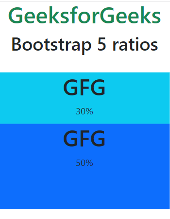
Example 1: In this example, we will demonstrate bootstrap 5 aspect ratios.

.png)