 |
VOOZH | about |
|
VOOZH | about |
Bootstrap has become one of the most popular front-end frameworks for building responsive and visually appealing web applications. It provides a collection of tools and components for creating user-friendly and interactive interfaces, helping developers build websites quickly and efficiently.
In this article, we’ve compiled the Top 50+ Bootstrap Interview Questions and Answers 2025, covering essential and advanced Bootstrap concepts. Whether you’re a beginner or an experienced developer with 3-5 years of hands-on experience, these questions will help you confidently prepare for your Bootstrap-related interviews.
Table of Content
Bootstrap is a free and open-source tool collection used for creating responsive websites and web applications. It is the most popular HTML, CSS, and JavaScript framework for developing responsive, mobile-first websites. Bootstrap is used for creating tables, forms, buttons, carousels, navigation bars, and images.
Bootstrap's features are
Bootstrap has 2 major layouts
Basic grid structure
A progress bar is used to display the progress of a process on a computer. It displays the range of completion of progress. The progress bar can be added to a web page using inbuilt bootstrap classes. Bootstrap has many types of progress bars. For Ex: .bg-success, .bg-info, bg-warning etc.
When compared to other web development platforms, Bootstrap provides more functionalities. It has significant browser support for practically all popular browsers, like Chrome, Firefox, Safari, etc. Web creation with Bootstrap is simple if you are familiar with CSS and HTML.
Feature | Bootstrap | Foundation |
|---|---|---|
Developer | Developed by Twitter | Developed by ZURB |
Popularity | Most widely used CSS framework | Less popular compared to Bootstrap but still widely used |
Responsive Design | Built-in responsive utilities and breakpoints | Provides flexible grid and media queries |
Performance | Can be heavy due to the number of components included | Typically lighter and more modular than Bootstrap |
Browser Support | Supports modern browsers and IE 10+ | Supports modern browsers and IE 11+ |
When the user clicks or hovers over the element then it shows data called Collapsing Element. This is the modern way to show a large amount of data to the user. We can also create our own collapsing element by using HTML, CSS, and JS. It makes the website very clean by collapsing the data while hovering or clicking on it. But Bootstrap facilitates the collapsing element property in its components. Bootstrap facilitates the collapsing element property
There are 3 types of lists supported by Bootstrap are:
In Boostrap 5, the card is the bordered box which contains the padding around the content.
Structure of a Bootrap Card
Now, let us understand with the help of the example:
Output:
Bootstrap media objects such as images or videos can be easily and efficiently aligned to the left or right of some content. Bootstrap media objects are used to place some data next to content to create complex and repetitive content components.
The media object classes available are:
A jumbotron is a big grey box used to indicate some text which requires extra attention. Any text that seems to be important can be written inside a jumbotron to make it appear big and noticeable.
Steps to add a jumbotron
Carousel is the slideshow component of bootstrap that is widely used for slideshow or cycling through different elements of an HTML document especially image containers or texts. The major use of the carousel plugin is to implement a slider or a slideshow of images. The HTML div containing images can also contain text.
By adding the class .img-responsive to the <img> tag in Bootstrap, images may be made responsive. This class gives the picture max-width: 100%; and height: auto; so that it scales well with the parent element.
Bootstrap Navbar is a navigation header that is located at the top of the webpage and can be extended or collapsed, depending on the screen size. Responsive navigation of our website is created by the bootstrap navbar.We can create a standard navigation bar with <nav class=” navbar navbar-default”>.
Navbar variations
Bootstrap Containers are the most basic layout element and are very essential for basic building blocks of bootstrap that wrap a page’s content. By using container we can align content according to the viewport or given device. We can define container within the container class (.container). In other words, we can also say that containers are established the width for the layout to give the content. All the elements and content are added within the container.
Bootstrap Grid System divides up to 12 columns across the page. You can use each of them individually or also can be merge together for wider columns. You can use 12 columns each of width 1 or use 4 columns each of width 3 or any other combination.
Icon fonts which can be used in web application are called Glyphicons. Bootstrap includes 260 glyphicons. These glyphicons are used for web projects from Bootstrap Glyphicons Halflings Set. Glyphicons Halflings are not available to free of cost, but their creator has made them available for Bootstrap free of cost.
For using the Glyphicons icon in Bootstrap, you can add the following code just about anywhere in your code. We can also leave a space for proper padding in between the icon and text:
<span class = "glyphicon glyphicon-search"></span>Forms are the most important and basic template of the website which is used for creating table, signup, login and feedback etc. Thus the availability of form templates in bootstrap has made it easy and we can directly use form templates from bootstrap.
Input Groups in Bootstrap are used to extend the default form controls by adding text or buttons on either side of textual inputs, custom file selectors, or custom inputs.
Basic input groups: The following classes are the base classes that are used to add the groups to either side of the input boxes.
Bootstrap 5 is the latest major release by Bootstrap in which they have revamped the UI and made various changes. Breadcrumbs are used to indicate the current page’s location within a navigational hierarchy.
<ol class="breadcrumb">
 <li class="breadcrumb-item"> Content .. </li>
</ol>Bootstrap Alerts are a technique for styling user messages. They send contextual feedback messages in response to common user behaviors. To alert, you can add an optional close icon. Create a wrapper <div> and add a class of .alert and one of the four contextual classes to create a basic alert.
To create a progress bar:
Feature | Bootstrap 4 | Bootstrap 5 |
|---|---|---|
jQuery Dependency | Requires jQuery | Removed jQuery, using vanilla JavaScript |
Grid System | Uses .row and .col-* classes | Introduced .g-* for gutters and improved grid system |
Flexbox | Flexbox-based layout | Improved Flexbox support and new utility classes |
Form Controls | Custom form controls required jQuery | Redesigned form controls with improved styles and no dependency |
Card Columns | .card-columns used for card layout | Removed .card-columns, replaced with CSS Grid layout |
Colors | Limited color palette | Expanded color palette with more variations |
When the user hover the element through mouse-pointer, the Tooltip component appears as a little pop-up box. The Popover component shows as a pop-up box when the user clicks on an element. More info might be stored in the popover.
The popover will show on the right side of the element by default, while the tooltip will appear on the top.
Column ordering classes in Bootstrap help to change the order of our grid system based on different screen sizes eg: desktop, mobile, tablet, and smartwatches. This makes the website more responsive to different screen sizes.
We use a handful of media queries for delivering different style sheets to different devices, to create sensible breakpoints for our layouts and interfaces. Most of the breakpoints are based on the minimum viewport width and allow the element to resize as the viewport changes.
Bootstrap uses the following media query ranges or breakpoints in Sass source files for layouts, grid systems and components by default.
Bootstrap provides cross-browser uniformity by using normalize. CSS resets have been replaced by normalize.css, a modern, HTML5-ready alternative. By default styling, it improves cross browser uniformity in HTML element.
To display the code on our webpage, bootstrap has some tags that can be used to display the code.
Method 1: The inline snippet of code wrapped in <code> tag. Inline code should be wrapped in <code> tags. The text which will be displayed is fixed-width and of red font color.
Method 2: Code block using <pre> tag to display the code as a standalone block element. For displaying multiple lines of code we can use this tag.
A panel is a rectangular component of Bootstrap, typically used to add content to the website. It can also have a header or footer, or both. Bootstrap also provides various classes to add padding to the content or multiple colors to make it more attractive.
CDN Link: First, include the style sheet in the code to use Bootstrap for creating the panel.
<link rel=”stylesheet” href=”https://maxcdn.bootstrapcdn.com/bootstrap/3.4.1/css/bootstrap.min.css%E2%80%9D>Add the following syntax to have a panel with the heading. The panel-heading class enables us to have a heading for our panel.
Scrollspy works according to the scroll position or the position at which the user is currently seeing.It targets the navigation bar contents automatically on scrolling the area. Scrollspy can be implemented in two ways:
For affixing a <div> to a certain area on a webpage, we utilize the affix plugin in Bootstrap. The plugin also lets you toggle pinning for the attached <div> on and off. The most common application of the affix plugin in Bootstrap is social icons.
The attached <div> starts at a specific point on the page and scrolls with it. However, beyond a certain point, it will be stuck in place, preventing the remainder of the webpage from scrolling.
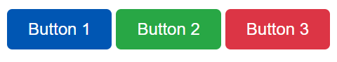
Bootstrap offers a variety of button classes:
Step-by-step guide for the implementation:
<a href="#" class="thumbnail">In Bootstrap, a well is a box that makes content appear inset. It's a way to style content on a web page.
A Button Group in Bootstrap is a collection of buttons placed together in a horizontal or vertical arrangement. Button groups allow you to create better UI for interactive elements by keeping related buttons aligned together. The .btn-group class is used for basic button groups. You can use the class .btn to wrap a set of buttons in .btn-group.
The two types of spinners that you can create using Bootstrap are border spinners and growing spinners.
<div class= "spinner-border" ></div><div class= "spinner-grow" ></div>Bootstrap provides a series of classes that can be used to apply various styling to the tables such as changing the heading appearance, making the rows stripped, adding or removing borders, making rows hoverable, etc. Bootstrap also provides classes for making tables responsive.
Toast is used to create something like an alert box which is shown for a short time like a couple of seconds when something happens. Like when the user clicks on a button or submits a form and many other actions.
Output
Badges are simple and basic components that are used to display an indicator or count a number. This is quite useful for mail count and alerting purposes, among other things. Badges are identical to labels, with the exception that they have more rounded corners.
The .badge-pill class is used to make the badges more rounded.
Step By Step Guide to Animate Progress Bar
The modal component is a dialog box/popup window that is displayed on top of the current page, once the trigger button is clicked. However, clicking on the modal’s backdrop automatically closes the modal. Also, it must be kept in mind that Bootstrap doesn’t support nested modals as they create a bad UI experience for the user. Therefore, only one modal window is supported at a time.
<div class="progress">
 <div class="progress-bar bg-success" style="width: 65%">
 <span class="sr-only">75% successfully completed</span>
 </div>
 <div class="progress-bar bg-warning" style="width: 20%">
 <span class="sr-only">30% completed with warnings</span>
 </div>
 <div class="progress-bar bg-danger" style="width: 15%">
 <span class="sr-only">15% did not complete</span>
 </div>
</div>
If we use the same .progress parent element for numerous bars, Bootstrap will combine them into a single progress bar. The sum of the progress bar in Bootstrap is 100 percent, as we all know. As a result, the progress bar will display the full width and fully populated result.
List Groups are used to display a series of content. We can modify them to support any content as per our needs. The use of List-Groups is just to display a series or list of content in an organized way.
Lead Body Copy is used to add emphasis to a paragraph in a body tag. The paragraph tags are inside the Body tags. This gives us a lightweight, large font size and a tall line height. This feature can be used using the pre-defined class “.lead” and see its functionality.
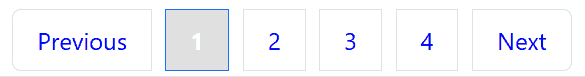
Pagination in Bootstrap is a way to link web pages together using a series of connected links. It's used to navigate between pages on a website.
Output: