 |
VOOZH | about |
|
VOOZH | about |
Bootstrap 5 Layout Utilities facilitate mobile-friendly, responsive websites. They offer numerous utility classes for tasks like displaying, hiding, aligning, and spacing content, enabling versatile modifications tailored to different design requirements.
| Name | Description |
|---|---|
| Changing display | Bootstrap 5 provides display properties for responsive output mixing with grid, content, or components. |
| Flexbox options | Flexbox in Bootstrap 5 for responsive layout design of components with dynamic arrangement. |
| Margin and padding | Bootstrap 5's margin and padding utility sets space with a six-level scale based on 1rem. |
| Toggle visibility | Bootstrap 5 toggles element visibility without changing the layout, providing control over the display. |
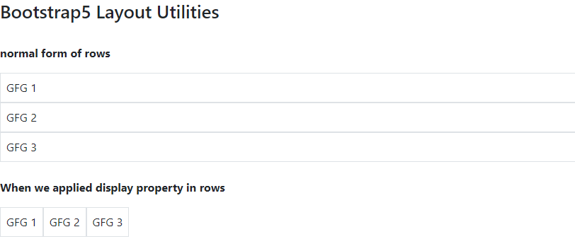
Example 1: In this example we demonstrates Bootstrap 5 Layout Utilities. It features two sections, one with inline display and another with block display, styled with padding, background color, and text color classes from Bootstrap.
Output:
Example 2: let's see an example of flexbox utility.
Output: