 |
VOOZH | about |
|
VOOZH | about |
Bootstrap 5 Layout Inline forms consist of a responsive horizontal layout. All of the elements are inline and left-aligned, and labels are alongside, and only apply to forms within viewports.
Bootstrap 5 Layout Inline forms used classes:
Syntax:
<form class="row-cols-lg-auto g-* align-items-center">
 <div class="col-*">
 <label class="visually-hidden">
 ...
 </label>
 <div class="input-group">
 <input type="text" class="form-control"
 placeholder="...">
 </div>
 </div>
</form>
Note: * can take values 1, 2, 3, and so on.
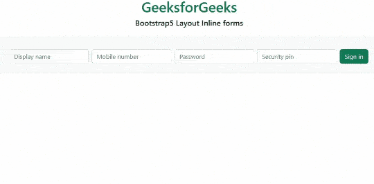
Example 1: In this example, we set the layout inline forms at the level of viewports on the small screen sizes.
Output:
Example 2: In this example, we set the layout of inline forms at the level of viewports screen sizes.
Output:
Reference:https://getbootstrap.com/docs/5.0/forms/layout/#inline-forms