VOOZH about

URL: https://www.geeksforgeeks.org/bootstrap/bootstarp-5-utilities-flexbox-options/

⇱ Bootstrap 5 Utilities Flexbox Options - GeeksforGeeks


  • Courses
  • Tutorials
  • Interview Prep

Bootstrap 5 Utilities Flexbox Options

Last Updated : 26 Apr, 2023

Bootstrap 5 layout utility classes are a set of pre-defined classes that can be used to create responsive and flexible layouts. These classes include options for setting the width and height of elements, controlling the placement of elements using margins and padding, and arranging elements using a flexbox. In this article, we'll know about Bootstrap 5 utilities flexbox options.

Flexbox options: Bootstrap 5 includes several Flexbox options that can be used with its utility classes to make it easier to create flexible and responsive layouts. These utilities can quickly add common flexbox properties to your HTML elements, such as flex-direction, justify-content, and align-items.

Syntax: First, we enable the flexbox in our code then we add the attribute, for enable the flexbox we add a class "d-flex".

<div class="d-flex">
 ...
</div>

Then, we add another class after the "d-flex" class for adding some attributes like:

<div class="d-flex flex-row justify-content-center">
 ...
</div>

Flexbox Utilities:

  • Enable Flex Behaviors: This is used to apply display utilities for creating a flexbox container and transform the child elements into flex items. With more flex properties, flex items and containers can be further modified.
  • Direction: The "flex-direction" property determines the direction of the flex container's main axis.
  • Justify content: It is used to align the flex items along the main axis in the flex container.
  • Align items: The "align-items" property aligns flex items along the cross-axis of the flex container.
  • Align self: The "align-self" property overrides the "align-items" property for a single flex item.
  • Grow and shrink: The "flex-grow" and "flex-shrink" properties control how much a flex item grows or shrinks relative to the other flex items in the container. They are set using numeric values.
  • Auto margin: The "mx-auto" utility class can be used to horizontally center a flex container or flex item within its parent container.
  • Wrap: The "flex-wrap" property determines whether flex items should wrap to the next row or column when there is not enough space in the flex container. 
  • Order: The "order" property determines the order in which flex items are displayed within the flex container. It can be set using numeric values, with lower values appearing first.

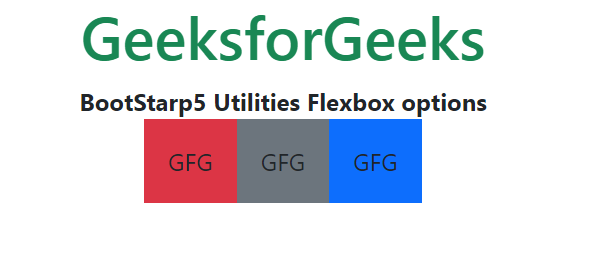
Example 1: Let's see an example of Enable Flex Behaviors of the Flexbox option.

Output:

👁 Image
 

Example 2: Let's see another example of the flexbox Order of the flexbox option.

Output:

👁 Image
 

Reference: https://getbootstrap.com/docs/5.0/layout/utilities/#flexbox-options

Comment
Article Tags:

Explore