 |
VOOZH | about |
|
VOOZH | about |
Bootstrap 5 Cards Border is part of the utilities that can be used to add borders on cards. Borderless cards are so ugly but the cards of bootstrap will always have borders. According to this utility, classes are used to define the color of the card borders.
Bootstrap 5 Cards Border Classes:
| Class | Description |
|---|---|
| border-primary | Set card border color to blue |
| border-secondary | Set card border color to gray |
| border-success | Set card border color to green |
| border-danger | Set card border color to red |
| border-warning | Set card border color to yellow |
| border-info | Set card border color to sky blue |
| border-light | Set card border color to light gray |
| border-dark | Set card border color to dark gray |
Syntax:
<div class="card border-warning ">
 <div class="card-header">..</div>
 <div class="card-body">
 <h5 class="card-title">...</h5>
 <p class="card-text">...</p>
 </div>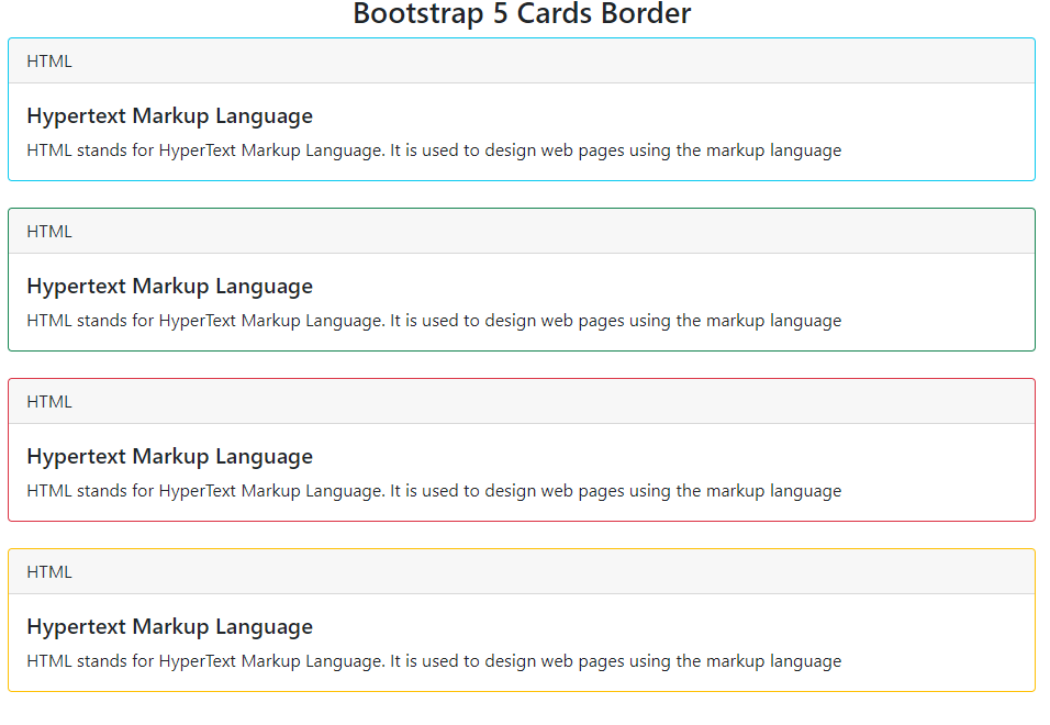
</div>Example 1: In this example, we Bootstrap 5 Cards with colored borders, featuring HTML content. Each card displays a header with "HTML" and provides information about Hypertext Markup Language.
Output:
Example 2: In this example, we will use Bootstrap 5 cards with various colored borders, each displaying a header with "HTML" and content about Hypertext Markup Language. Borders include primary, secondary, light, and dark.
Output: