 |
VOOZH | about |
|
VOOZH | about |
Bootstrap 5 Cards navigation refers to a user interface design pattern where related information is organized into individual cards that can be interacted with and rearranged for easy viewing and access. This approach is commonly used in mobile app design and website design for a visually appealing and organized way of presenting the information.
Bootstrap 5 Cards Navigation used classes:
<div class="card">
 <div class="card-header">
 <ul class="nav nav-tabs card-header-tabs">
 <li class="nav-item">
 <a class="nav-link" href="...">
 ...
 </a>
 </li>
 </ul>
 </div>
</div>
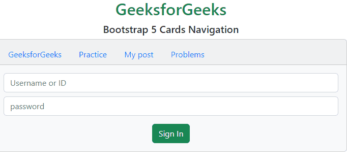
Example 1: In this example, we set the elements on the top of the card's header using .nav-item classes.
Output:
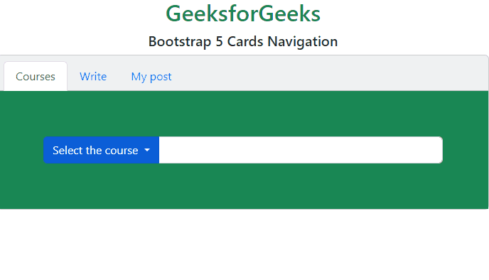
Example 2: In this example, we set the elements at the top of the card's header and also activate an element using .nav-item classes.
Output:
Reference:https://getbootstrap.com/docs/5.0/components/card/#navigation