VOOZH about

URL: https://www.geeksforgeeks.org/bootstrap/bootstrap-5-carousel-sass/

⇱ Bootstrap 5 Carousel SASS - GeeksforGeeks


  • Courses
  • Tutorials
  • Interview Prep

Bootstrap 5 Carousel SASS

Last Updated : 23 Jul, 2025

Bootstrap 5  Carousel SASS has a set of variables with default values that can be changed to customize the Carousel.

Bootstrap 5 Carousel Sass

  • Variables: Carousel variables have a default value that can be customized to make a new Carousel layout.

Default values of Carousel SASS variables

$carousel-control-color: $white;
$carousel-control-width: 15%;
$carousel-control-opacity: 0.5;
$carousel-control-hover-opacity: 0.9;
$carousel-control-transition: opacity .15s ease;
$carousel-indicator-width: 30px;
$carousel-indicator-height: 3px;
$carousel-indicator-hit-area-height: 10px;
$carousel-indicator-spacer: 3px;
$carousel-indicator-opacity: .5;
$carousel-indicator-active-bg: $white;
$carousel-indicator-active-opacity: 1;
$carousel-indicator-transition: opacity .6s ease;
$carousel-caption-width: 70%;
$carousel-caption-color: $white;
$carousel-caption-padding-y: 1.25rem;
$carousel-caption-spacer: 1.25rem;
$carousel-control-icon-width: 2rem;
$carousel-transition-duration: 0.6s;
$carousel-dark-indicator-active-bg: $black;
$carousel-dark-caption-color: $black;
$carousel-dark-control-icon-filter: invert(1) grayscale(100);

Description of Carousel SASS variables

  • $carousel-control-color: It is the color of the next and prev icons.
  • $carousel-control-width: It is the width of the next and prev icons.
  • $carousel-control-opacity: Opacity of next and prev icons.
  • $carousel-control-hover-opacity: Opacity when you hover next and prev icons.
  • $carousel-control-transition: Transition of the prev and next icons.  
  • $carousel-indicator-width: Width of the indicators which are at bottom of the carousel.         
  • $carousel-indicator-height: Height of the indicators which are at bottom of the carousel.        
  • $carousel-indicator-hit-area-height: Height of the hit area of indicator.
  • $carousel-indicator-spacer: Space between indicators in the carousel.  
  • $carousel-indicator-opacity: Opacity of the indicators in the carousel.        
  • $carousel-indicator-active-bg: Background color when the indicator is active.  
  • $carousel-indicator-active-opacity: Opacity of the indicator when it is active.
  • $carousel-indicator-transition: Transition of the indicators.  
  • $carousel-caption-width: Width of the caption which is in the carousel.          
  • $carousel-caption-color: Color of the caption in the carousel.         
  • $carousel-caption-padding-y: Padding in y-axis for caption in the carousel.    
  • $carousel-caption-spacer: Spacing between captions in the carousel.         
  • $carousel-control-icon-width: Width of the prev and next icons in the carousel.      
  • $carousel-transition-duration: Time is taken for the transition.   
  • $carousel-dark-indicator-active-bg: Background color for the indicators when they are active in a dark theme.  
  • $carousel-dark-caption-color: Color of the caption in the carousel in dark theme.    
  • $carousel-dark-control-icon-filter: Icon filter in dark theme in the carousel. 

Steps to override SCSS of Bootstrap:

Step 1: Install bootstrap using the following command

npm i bootstrap

Step 2: Create your custom scss file and write the variable you want to override. Then include the bootstrap scss file using import.

@import "../node_modules/bootstrap/scss/bootstrap.scss";
$variable_to_override: value;

Step 3: Convert the SCSS file to CSS using a live server extension.

Step 4: Include the CSS file in your HTML file.

<link rel="stylesheet" href="./assets/css/style.css">

Project Structure :

👁 Image

Syntax:

$carousel-control-icon-width: 5rem;
...

.carousel-control-prev-icon,
.carousel-control-next-icon {

width: $carousel-control-icon-width;
height: $carousel-control-icon-width;
...
}

'. . . ' refers to other variables from the list of variables.

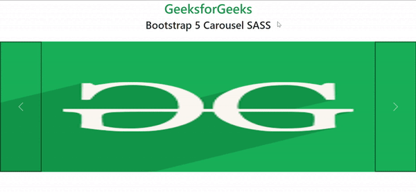
Example 1: In this example, we have modified the $carousel-control-icon-width variable to 5rem from its default value of 2rem.

style.scss

style.css

index.html

Output:

👁 Image

Example 2: In this example, we have modified variables to customize our carousel.

style.scss

style.css

index.html

Output:

👁 p1-ezgifcom-optimize

References: https://getbootstrap.com/docs/5.0/components/carousel/#sass

Comment

Explore