 |
VOOZH | about |
|
VOOZH | about |
Bootstrap 5 Checks and radios Checkbox Toggle buttons are a way of visualizing the checkboxes as buttons and primarily the .form-check is changed to .btn-check and the .form-check-label is changed to buttons classes. There are three toggle states, the first is checked followed by unchecked and disabled in which all can be done by adding or not adding some attributes.
Bootstrap 5 Checks and radios Checkbox Toggle buttons Classes:
Syntax:
<input type="checkbox" class="btn-check" checked/disabled>
<label class="btn" for="btn-check">...</label>
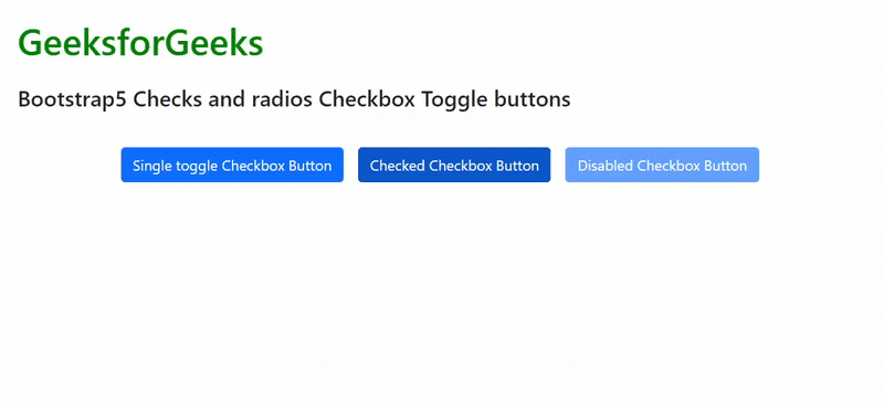
Example 1: In the code below all the three toggle states are demonstrated and the output shows them, in action:
Output:
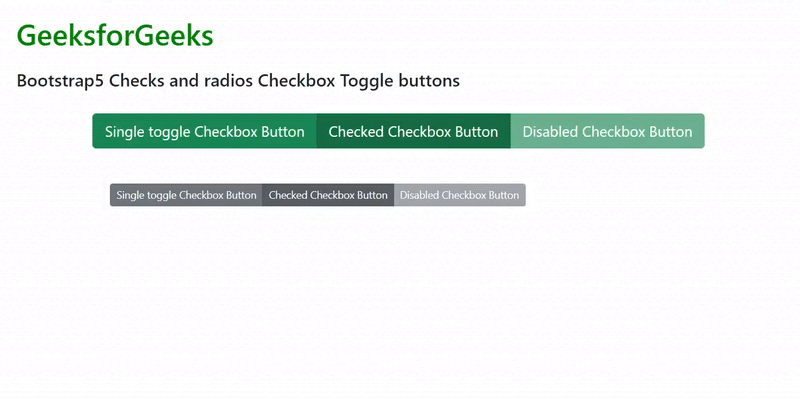
Example 2: The code below demonstrates how we can use button groups with checkbox toggle buttons and also we can set sizes of the buttons:
Output:
Reference:https://getbootstrap.com/docs/5.0/forms/checks-radios/#checkbox-toggle-buttons