 |
VOOZH | about |
|
VOOZH | about |
Bootstrap 5 Flex Direction is set by using the direction utilities for flex items in a flex container.
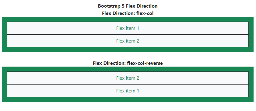
The default browser setting is for the horizontal direction with the use of the flex-row class. For horizontal direction from the opposite side, the class used is flex-row-reverse. Use flex-column class for vertical direction and flex-column-reverse class for opposite side vertical direction.
Bootstrap 5 Flex Direction Classes:
| Class | Description |
|---|---|
| flex-row | Sets default browser horizontal direction. |
| flex-row-reverse | Sets horizontal direction from the opposite side. |
| flex-column | Sets vertical direction. |
| flex-column-reverse | Sets vertical direction from the opposite side. |
| flex-*-row | Sets default browser horizontal direction for responsiveness. |
| flex-*-row-reverse | Sets horizontal direction from the opposite side for responsiveness. |
| flex-*-column | Sets vertical direction for responsiveness. |
| flex-*-column-reverse | Sets vertical direction from the opposite side for responsiveness. |
Note: Responsive variants also exist for flex-direction classes, in the above classes, the '*' can be replaced by device breakpoints i.e. sm, md, lg, xl, and xxl.
Syntax: In order to make a flexbox container and convert direct children into flex items, we have to use the d-flex class. This will make our container a flexbox container so we can manipulate the items according to our needs. The '*' can be replaced by device breakpoints such as sm, md, lg, xl, and xxl.
<div class="d-flex Flex Direction Class">
 ...
</div>
Note: You can also create an inline flex container using the class d-inline-flex.
Example 1: If you want your items placed horizontally one after another, then you need to mention the flex-row class. If your items need to be reversely aligned, then you have to mention the flex-row-reverse class.
Output:
Example 2: When you want your items to be placed in stacked order, you can use the flex-column class. If you want to stack in opposite/reverse order, use the flex-column-reverse class.
Output: