 |
VOOZH | about |
|
VOOZH | about |
Bootstrap 5 Flex fill can be used to force the flex items to take the width according to their content. If the content of any sibling element does not exceed its border, all the flex items with flex fill classes will take up equal widths.
Bootstrap 5 Flex Fill Classes:
Note: '*' can be replaced by sm/md/lg/xl/xxl.
Syntax:
<div class="d-flex">
 <div class="flex-fill class">
 ...
 </div>
</div>
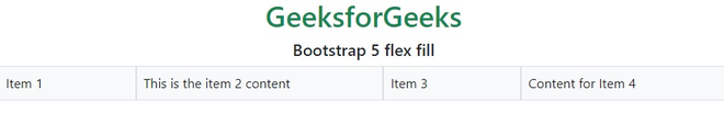
Example 1: In this example, we set the flex fill to force the flex items to take the width according to the content using flex fill classes.
Output:
Example 2: In this example, we set the flex fill to force the flex items to take the width of content to achieve this effect on a large screen size.
Output:
Reference: https://getbootstrap.com/docs/5.0/utilities/flex/#fill