 |
VOOZH | about |
|
VOOZH | about |
Bootstrap 5 Flex Media object class can be used to align images or videos to the left or right with content in an easy and efficient manner. The Bootstrap Flex Media object is used where some data is positioned alongside content to build up complicated.
Bootstrap 5 Flex Media object classes: There is no pre-defined class for flex media objects we can use the Bootstrap 5 Flex Grow and shrink classes.
Note: The ‘*‘ can be replaced by 1 or 0, and ** can be replaced by sm/md/lg/xl/xxl screen sizes.
Syntax:
 <div class="d-flex">
 <div class="flex-shrink-0">
 <img src="...">
 </div>
 <div class="flex-grow-1">
 ...
 </div>
</div>
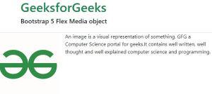
Example 1: In this example, we set the text content aligned with the image using Flex Media object classes.
Output:
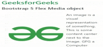
Example 2: In this example, we set the text content at the center next to the image.
Output:
Reference: https://getbootstrap.com/docs/5.0/utilities/flex/#media-object