 |
VOOZH | about |
|
VOOZH | about |
Bootstrap is one of the most popular frameworks for web developers. Developers utilize it to improve the front-end's responsiveness. If we follow the bootstrap documentation, we will see numerous possibilities for incorporating layout into a website.
Bootstrap 5 layout contains various subtopics, which we have discussed one by one here with the help of examples.
Table of Content
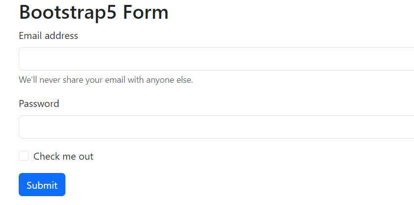
In Bootstrap, form elements should be enclosed within a <form> tag. While Bootstrap doesn't style the <form> element by default, it utilizes browser features effectively. Buttons inside a form default to type="submit", so it's important to specify the type. You can disable all form elements within a form using the disabled attribute on the <form>. By default, Bootstrap forms stack vertically due to applied styles, but you can customize this layout using additional classes.
Example
Output:
👁 Screenshot-2024-02-16-114740
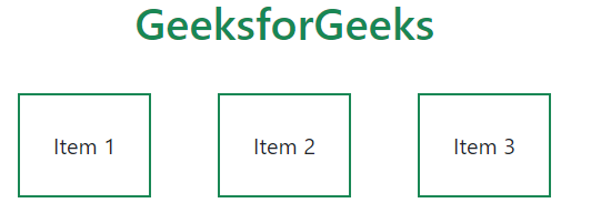
The bootstrap layout includes utility classes, which helps in the creation of outstanding responsive websites. One of the most significant and commonly used classes is "d-flex", which permits the display property as a flex container and may be customised as needed; below is an example. Here, we can see that after applying the "d-flex" class, we used the "justify-content-center" class to centre the position of the divs, as well as adding margin and padding.
Example: Illustration of Boostrap utilities.
Output:
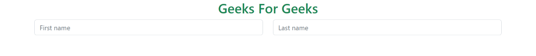
The form grid is simply a normal grid with the same features as we saw earlier. In a typical bootstrap grid system, we employ the "row" and "col" classes, and the same is true for the form layout.
Example: Illustration of form grid in bootstrap.
Output:
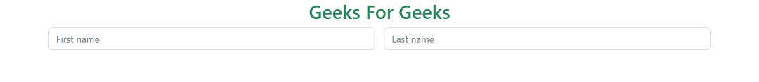
In bootstrap gutter we use the "g" classes for adding margin or padding between elements. So we will use the same for the form gutters also. As we can see, there are no such changes, only a change in code, as we utilised the "g-3" class.
Example: Implementation to create form gutter.
Output:
To create horizontal forms using the grid, add the.row class to form groups and use the.col-*-* classes to set the width of your labels and controls. Add.col-form-label to your <label>s to centre them vertically with the corresponding form controls. As we can see, this is a rather sophisticated form, therefore we're using a grid system with radio buttons, a checkbox button, and a typical submit button. And they are all horizontally aligned, which is why we call them horizontal forms.
Example: Implementation to create horizontal form .
Output:
This component allows us to resize the form columns as well as the labels, making it an extremely important class for making a website responsive. To align with the size of.form-control-lg and.form-control-sm, use.col-form-label-sm or.col-form-label-lg for your <label>s or <legend>. The code indicates that "col-form-label-sm" or "col-form-label-lg" are appropriate sizes for the project.
Example: Implementation to create horizontal form with label sizing.
Output:
As demonstrated in the preceding instances, our grid system allows you to include any number of.cols within a "row". They will divide the available breadth equally between themselves. You can also select a subset of your columns to take up more or less space, while the remaining "cols" divide the rest equally, using column classes like "col-sm-7". Here we set different sizes for the columns with the col and row classes.
Example: Implementation to create column sizing.
Output:
It is a significant attribute since it uses a flexbox utility to vertically centre the items and converts "col" to "col-auto" so that your columns only take up the space they require. In other words, the column size is determined by its contents. Here we can clearly see how auto scaling works because the form we generated resizes itself as the screen size changes.
Example: Implementation to showcase auto sizing.
Output:
Use the "row-cols-*" classes to construct responsive horizontal layouts. By adding gutter modifier classes, we will have gutters in both horizontal and vertical directions. On small mobile viewports, the "col-12" helps stack form controls and other elements. The "align-items-center" property moves the form elements to the centre, ensuring that the "form-check" is properly aligned.
Example: Illustration of Inline Form in Bootstrap.
Output:
.png)
.png)
.png)
.png)
.png)