 |
VOOZH | about |
|
VOOZH | about |
Bootstrap 5 Grid system is a powerful mobile-first responsive flexbox grid that allows up to 12 columns across the page. You can also group the columns together.
The equal-width grid system is basically used to create the grid in equal sizes. With the help of classes, we will manage the grid's width.
Grid system Equal-width used Classes:
Note: you can also use another class of bootstrap like border class for creating a border of the grid and text color classes.
Syntax:
 <div class="row">
 <div class="col">
 ...
 </div>
 ...
 </div>
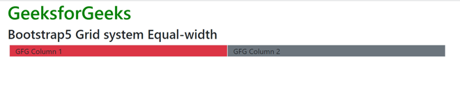
Example 1: In this example, we will use .row and .col classes to create two grids of equal width.
Output:
Example 2: In this example, we will use .row and .col classes to create different grids of different equal widths.
Output:
Reference: https://getbootstrap.com/docs/4.0/layout/grid/#equal-width