 |
VOOZH | about |
|
VOOZH | about |
Grid system Variable width content means in a grid system we can add a setting where the column will adjust to the content inside it and occupy that space only. In this setting, we can add responsiveness by which we can specify the screen size above which that column will have variable width with content.
BootStrap 5 Grid System Variable Width Content Classes:
Syntax:
<div class="row">
 <div class="col-[i]-auto">
 content
 </div>
</div>
Example 1: The code below demonstrates how the variable width content in a grid works:
Output:
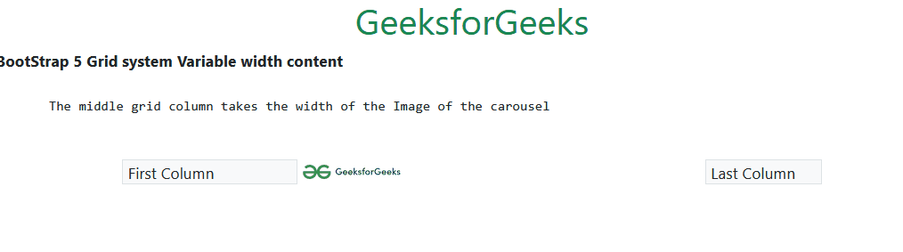
Example 2: The code below demonstrates how when the image size of the carousel changes the width of the middle grid which has the Variable width content also changes:
Output:
Reference:https://getbootstrap.com/docs/5.0/layout/grid/#variable-width-content