Bootstrap 5 Popovers SASS has a set of variables that are usually set to a default value but it can be changed accordingly to customize the Popover.
SASS variable of Popovers: SASS variables and their default values:
$popover-font-size ($font-size-sm): This variable is used to change the font size of the text inside the popover.
$popover-bg ($white): This variable is used to change the background color of the popover.
$popover-max-width (276px): This variable is used to change the maximum width of the popover.
$popover-border-width ($border-width): This variable is used to change the width of the border of the popover.
$popover-border-color (rgba($black, .2)): This variable is used to change the color of the border of the popover.
$popover-border-radius ($border-radius-lg): This variable is used to change the value of the border-radius of the popover.
$popover-inner-border-radius(subtract($popover-border-radius, $popover-border-width)): This variable is used to change the value of the border-radius on the inner side of the popover.
$popover-box-shadow($box-shadow): This variable is used to change the value of the box-shadow applied to the popover.
$popover-header-bg (shade-color($popover-bg, 6%)): This variable is used to change the background color of the header part of the popover.
$popover-header-color ($headings-color): This variable is used to change the color of the content in the header of the popover.
$popover-header-padding-y (.5rem): This variable is used to change the padding at the y-axis in the header part of the popover.
$popover-header-padding-x ($spacer): This variable is used to change the padding at the x-axis in the header part of the popover.
$popover-body-color ($body-color): This variable is used to change the color of the content in the body part of the popover.
$popover-body-padding-y ($spacer): This variable is used to change the padding at the y-axis in the body part of the popover.
$popover-body-padding-x ($spacer): This variable is used to change the padding at the x-axis in the body part of the popover.
$popover-arrow-width (1rem): This variable controls the value of the width of the arrow of the popover.
$popover-arrow-height (.5rem): This variable controls the value of the height of the arrow of the popover.
$popover-arrow-color ($popover-bg): This variable is used to change the color of the arrow of the popover.
$popover-arrow-outer-color (fade-in($popover-border-color, .05)): This variable is used to change the outer color of the arrow of the popover.
Steps to override SCSS of Bootstrap:
Step 1: Install Bootstrap using the following command
npm i bootstrap
Step 2: Create your custom SCSS file and write the variable you want to override. Then include the bootstrap scss file using import.
$variable_to_override: value
@import "../node_modules/bootstrap/scss/bootstrap.scss";
Step 3: Convert the SCSS file to CSS using a live server extension.
Step 4: Include the CSS file in your HTML file.
<link rel="stylesheet" href="style.css">
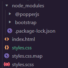
Project Structure: The following structure will be generated after completing the above procedure:
Example 1: The code demonstrates how to set the $popover-bg, $popover-font-siz, $popover-border-color, $popover-border-width and $popover-body-color to customize the Popover:
styles.scss:
styles.css: The above SCSS file is compiled into this CSS file(only the changes shown). This file is used in the below "index.html" file.
index.html:
Output:
Example 2: The code demonstrates how to set the $popover-bg, $popover-font-size, $popover-max-width, $popover-border-color, $popover-border-width, $popover-border-radius and $popover-header-bg to customize the Popover:
styles.scss:
styles.css: The above SCSS file is compiled into this CSS file(only the changes shown). This file is included in the below "index.html" file.
