 |
VOOZH | about |
|
VOOZH | about |
The Bootstrap 5 Progress is used to show the progress of a task to the user. A progress bar displays how much your process progressed or is completed and left. We can use background utility classes to change the appearance of progress bars.
Prerequisite: Bootstrap 5 Progress component to create, stack, animate progress bars and place text labels over them.
Bootstrap 5 Progress Backgrounds Class: There is no individual color for this, we can use Bootstrap 5 Background Color classes to color the progress bars.
Syntax:
<div class="progress">
 <div
 class="progress-bar bg-warning"
 role="progressbar"
 style="width: x%"
 aria-valuenow="..."
 aria-valuemin="..."
 aria-valuemax="...">
 </div>
</div>
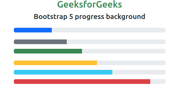
Example 1: In this example, we set different informative background colors for the progress components.
Output:
Example 2: In this example, we set the progress bars with light, dark, transparent, and white colors.
Output:
Reference: https://getbootstrap.com/docs/5.0/components/progress/#backgrounds