 |
VOOZH | about |
|
VOOZH | about |
Bootstrap 5 Progress SASS has a set of variables with default values and keyframes which are used to create CSS animations for the progress bars.
Bootstrap 5 Progress Sass:
SASS variables with their default values:
$progress-height: 1rem;
$progress-font-size: $font-size-base * .75;
$progress-bg: $gray-200;
$progress-border-radius: $border-radius;
$progress-box-shadow: $box-shadow-inset;
$progress-bar-color: $white;
$progress-bar-bg: $primary;
$progress-bar-animation-timing: 1s linear infinite;
$progress-bar-transition: width .6s ease;
Description of SASS variables of Progress:
Steps to override SCSS of Bootstrap:
Step 1: Install bootstrap using the following command
npm i bootstrap
Step 2: Create your custom SCSS file and write the variable you want to override. Then include the bootstrap SCSS file using import.
@import "../node_modules/bootstrap/scss/bootstrap.scss";
$variable_to_override: value;
Step 3: Convert the SCSS file to CSS using a live server extension.
Step 4: Include your CSS file in your HTML file.
<link rel="stylesheet" href="./assets/css/style.css">
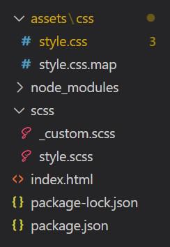
Project Structure:
Syntax:
// Variables
$progress-height: value;
$progress-bg: value;
$progress-border-radius: value;
...

// Keyframes
@if $enable-transitions {
 @keyframes progress-bar-stripes {
 *
 }
}
'. . . ' in the above syntax are other variables that you can add and set their value.
'*' in the above syntax refers to animation CSS that you can add there.
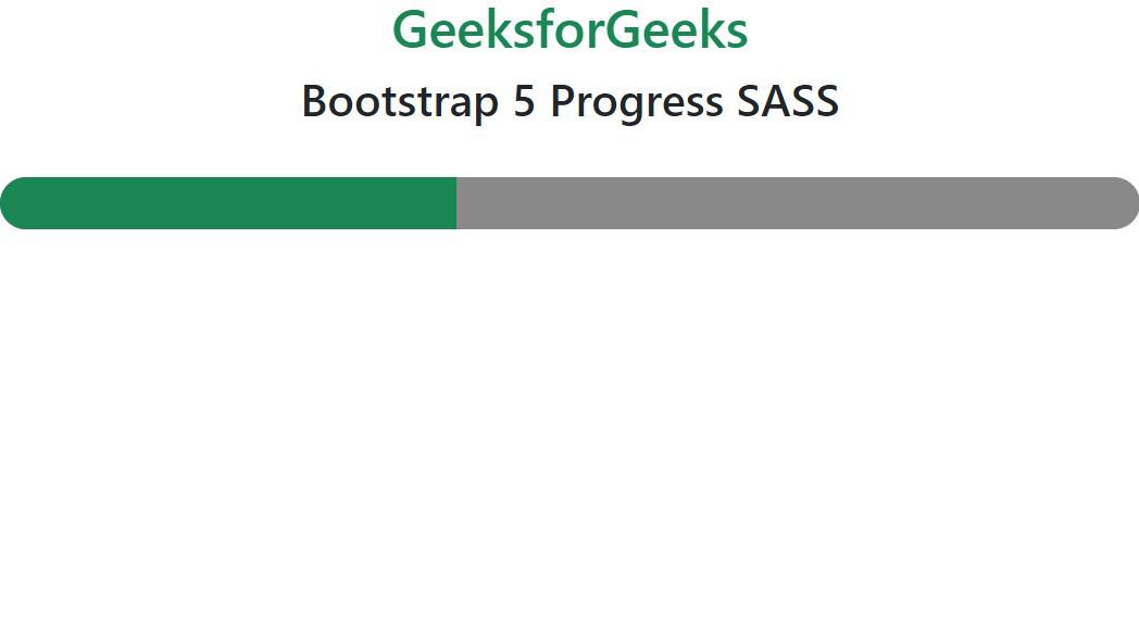
Example 1: Values of variables are modified from default values in SCSS file.
Output:
Example 2: Keyframes are used in this example to show the animated strips
Output:
Reference: https://getbootstrap.com/docs/5.0/components/progress/#sass
.gif)