 |
VOOZH | about |
|
VOOZH | about |
Bootstrap 5 Toasts Custom content is used to add your own markup by removing sub-components. Users can easily Customize toasts by adding their own content or by adding other bootstrap components inside toast. There are no predefined classes for toast custom content. You can custom-create them by giving additional controls and adding components like cards, icons, etc inside the toast.
Pre-requisite: Bootstrap 5 Toast knowledge required.
Bootstrap 5 Toasts Custom content Class: There is no predefined class to create custom content on the toast, we can use any Bootstrap 5 utilities, flex-box utilities, or Bootstrap 5 Icons.
Syntax:
<div class="toast" role="alert">
 <div class="toast-header">
 Toast Header
 </div>
 <div class="toast-body">
 <!-- Custom Content for toast body-->
 </div>
</div>
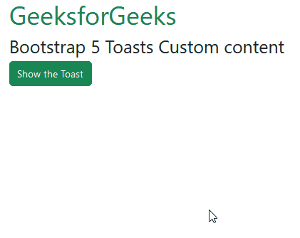
Example 1: In this example, we customize the toast content by adding two bootstrap buttons inside it.
Output:
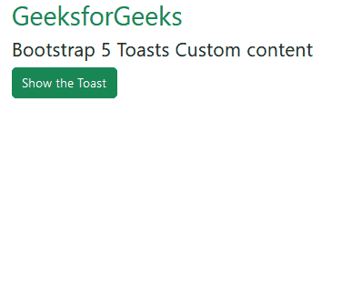
Example 2: In this example, we added a card inside the toast component. The card has some text and a button inside it.
Output:
Reference:https://getbootstrap.com/docs/5.0/components/toasts/#custom-content