 |
VOOZH | about |
|
VOOZH | about |
Bootstrap 5 Toasts SASS has a set of variables with default values that can be changed to customize the toasts.
Default values of SASS variables of Toasts:
$toast-max-width: 350px;
$toast-padding-x: 0.75rem;
$toast-padding-y: 0.5rem;
$toast-font-size: 0.875rem;
$toast-color: null;
$toast-background-color: rgba($white, .85);
$toast-border-width: 1px;
$toast-border-color: rgba(0, 0, 0, .1);
$toast-border-radius: $border-radius;
$toast-box-shadow: $box-shadow;
$toast-spacing: $container-padding-x;
$toast-header-color: $gray-600;
$toast-header-background-color: rgba($white, .85);
$toast-header-border-color: rgba(0, 0, 0, .05);
Description of Sass variables of Toasts:
Steps to override SCSS of Bootstrap:
Step 1: Install bootstrap using the following command
npm i bootstrap
Step 2: Create your custom scss file and write the variable you want to override. Then include the bootstrap scss file using import.
@import "../node_modules/bootstrap/scss/bootstrap.scss";
$variable_to_override: value;
Step 3: Convert the SCSS file to CSS using live server extension.
Step 4: Include CSS file in your HTML file.
<link rel="stylesheet" href="./assets/css/style.css">
Project Structure :
Syntax:
$toast-font-size: value;
$toast-color: value;
$toast-max-width: value;
...
'. . .' above means you can add other variables and their values.
Example 1: In this example, we have modified $toast-font-size , $toast-color, $toast-max-width variables.
style.scss
style.css
index.html
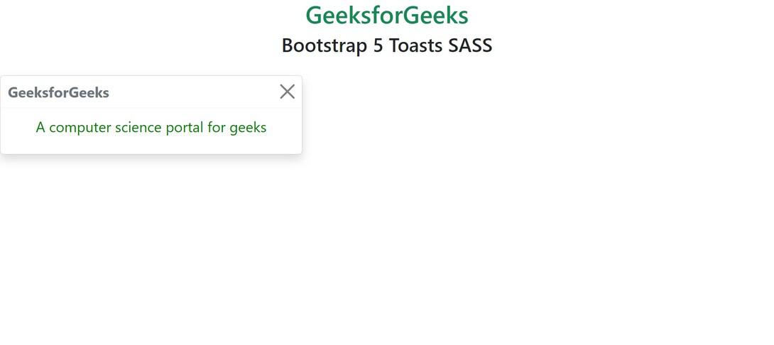
Output:
Example 2: In this example, we have modified $toast-padding-x , $toast-border-radius, $toast-background-color variables to customize toasts.
style.scss
style.css
index.html
Output:
References: https://getbootstrap.com/docs/5.0/components/toasts/#sass